

Sign design tips and what to avoid
30 Dec 2019 by Judy Doig
Item 1 of 1
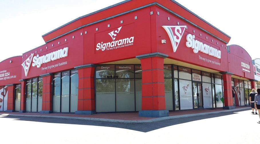
Your sign says a lot about your business and is often one of the most effective ways to attract new customers and boost brand awareness. This is why it is so important that your signs are of high quality, and designed effectively.
Signarama Maroochydore can guide you through the entire signage process from an initial quote through to designing your sign to actually having it installed. We are in the know about sign design do’s and don’t and we would like to share these few tips with you to ensure that you know what will work for your signs and your business.
Less Is More
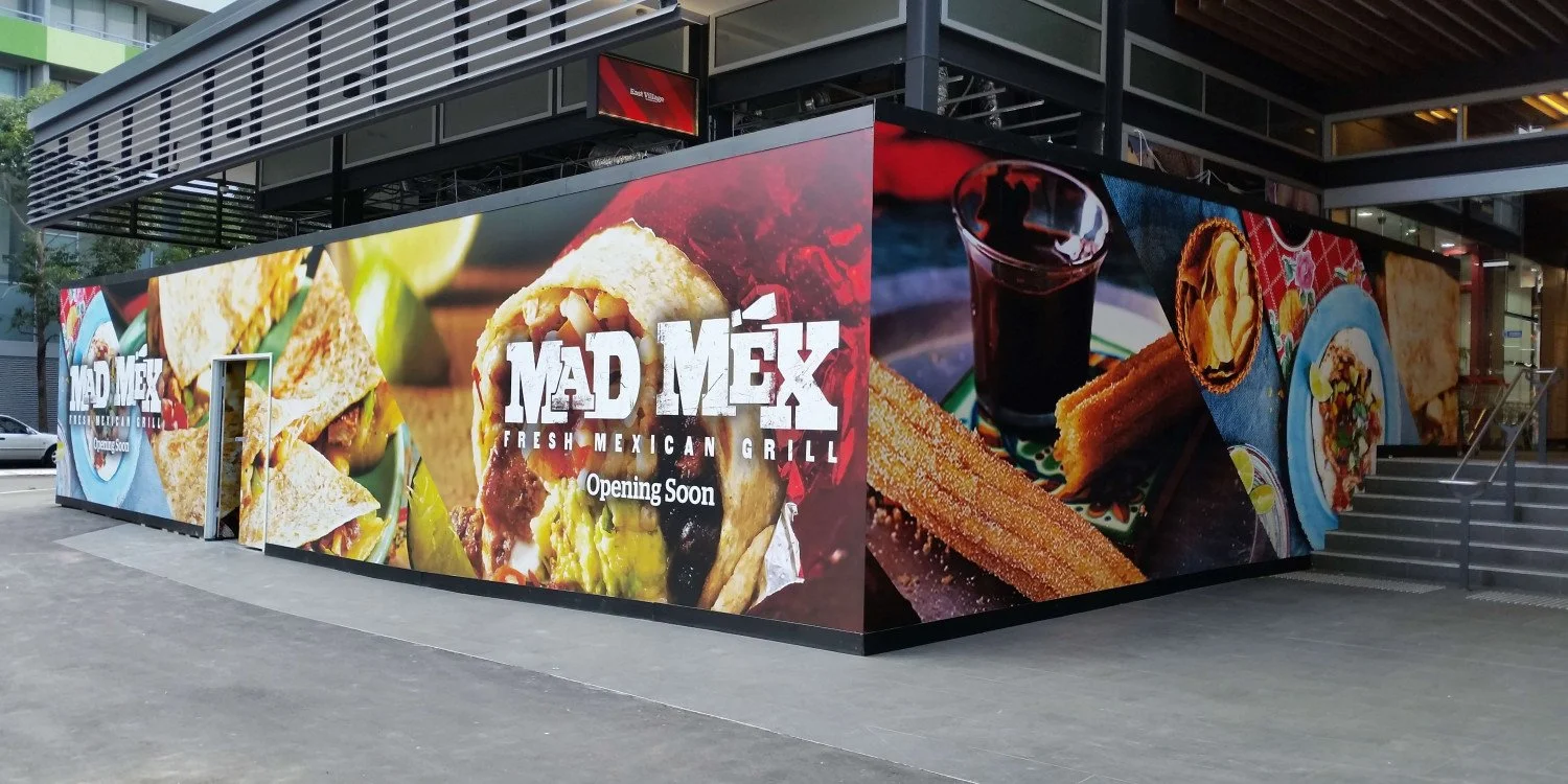
Your signs need to be easily visible and legible. Less is more is important as if a sign is too cluttered people will not bother to take in all of the information. If your sign is easy to read from a distance and in a short amount of time, people will be able to retain the information much more effectively. Keep your message short and simple and ensure that the visuals of the sign are appealing and eye-catching. Again, it is important that your visuals are simple and clear. Did you know that the white or “blank” space on a sign is just as important as the other design features? This space makes the sign easier to read and more clear to see from a distance, which is especially important for outdoor signs.
Choose the right fonts
Your signs text should always be easy to read. If you choose a font that is creative, funky and fun but cannot be easily read from a distance and at a glance, your sign is ineffective and will not generate the results you are after. Generally, it is advised that you never use more than two different fonts in a single design and that you choose two fonts that complement each other in order for your message to stand out.
Background colours
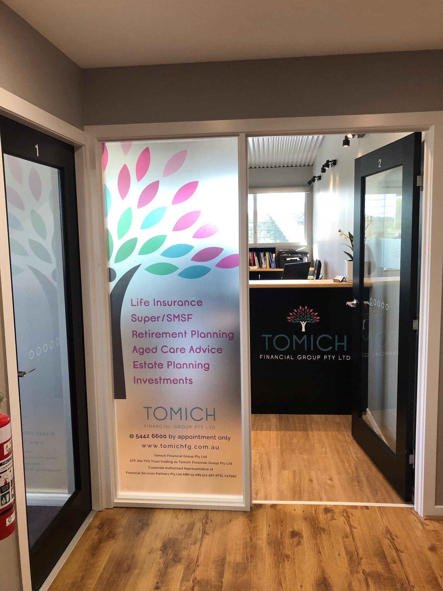
Another element that can affect the readability of your sign is the colours that you select for the background. It is important that you choose a colour that compliments the other design features and allows these to stand out and be easily read. A background colour that contrasts with the text and message of a sign will be easy to read, for example, a black background with white or light texts will be easy to read due to their contrast.
There are many other things to consider when designing a sign and the friendly and professional team at Signarama Maroochydore can help guide you through this process and even design your signage for you to ensure that it is as effective as it can be. Contact us today to discuss any of your signage needs.


Signarama Maroochydore
2/26 Trinder Avenue
Maroochydore Queensland 4558
If you need help outside regular business hours, call Andrew at 0418 860 150.
Opening Hours:
Monday
08:00 - 16:00
Tuesday
08:00 - 16:00
Wednesday
08:00 - 16:00
Thursday
08:00 - 16:00
Friday
08:00 - 16:00
contact
Signarama Maroochydore
CLIENTS WE HAVE WORKED WITH: