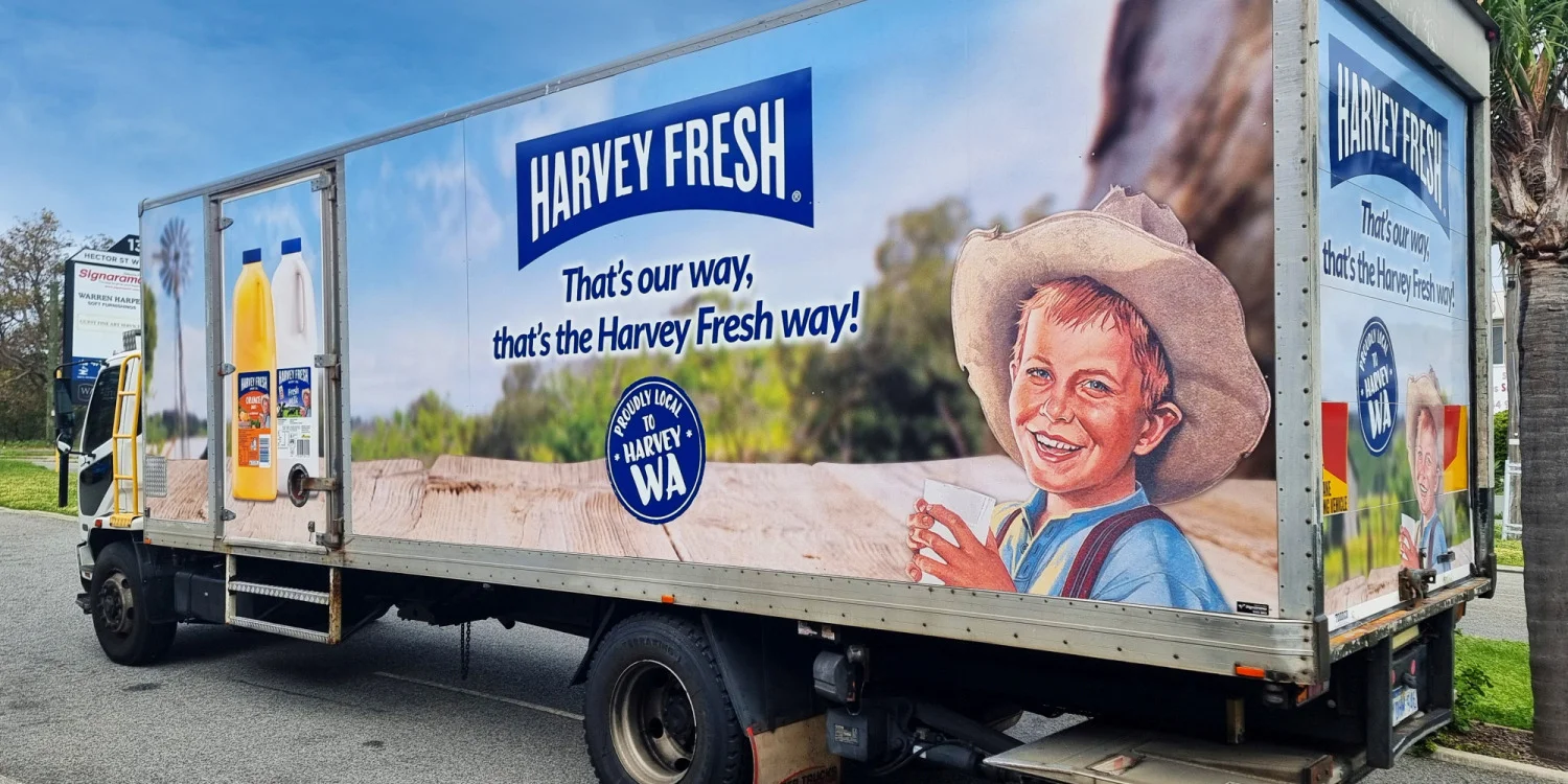


Our Work – Signarama Osborne Park
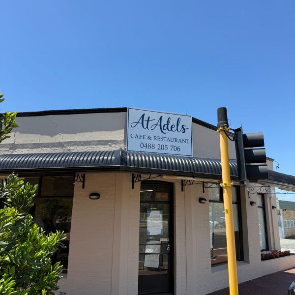
Welcoming a New Local Favourite: At Adels Café & Restaurant, South Perth
7 Jan 2026 by Michael McHugh
There’s something special about helping a new hospitality venue make its mark — and At Adels Café & Restaurant in South Perth is a perfect example of how thoughtful signage can set the tone from the very first glance.
The team at At Adels wanted signage that felt elegant, welcoming, and timeless, while still being highly visible to passing foot traffic and vehicles. Our brief was to create a cohesive signage package that enhanced the building’s character and reflected the warmth of the dining experience inside.
A Cohesive Signage Package — Inside and Out
For this project, we delivered a mix of external branding and window treatments, designed to work together seamlessly.
What we installed:
Fascia Signage
A clean, highly visible fascia sign positioned above the awning to clearly announce At Adels Café & Restaurant to the street. This ensures strong brand presence from multiple approach angles.
Window Frosting with Logo Detail
Frosted window film was applied to provide privacy for diners while still allowing natural light into the space. The gold logo overlay adds a refined, premium touch — a subtle detail that elevates the entire frontage.
Front Door Signage & Trading Hours
Gold vinyl lettering on the entry door clearly displays the brand and opening hours, delivering clarity and professionalism right at the point of entry.
The Result
The finished signage creates a polished, inviting street presence that complements the architecture of the building and reinforces At Adels’ brand identity. It’s understated, elegant, and designed to stand the test of time — exactly what you want for a new restaurant launchings.
We’re proud to have partnered with the At Adels team and wish them every success as they welcome the South Perth community through their doors.
If you’re opening a new venue or refreshing an existing one, our team would love to help bring your brand to life.
Read more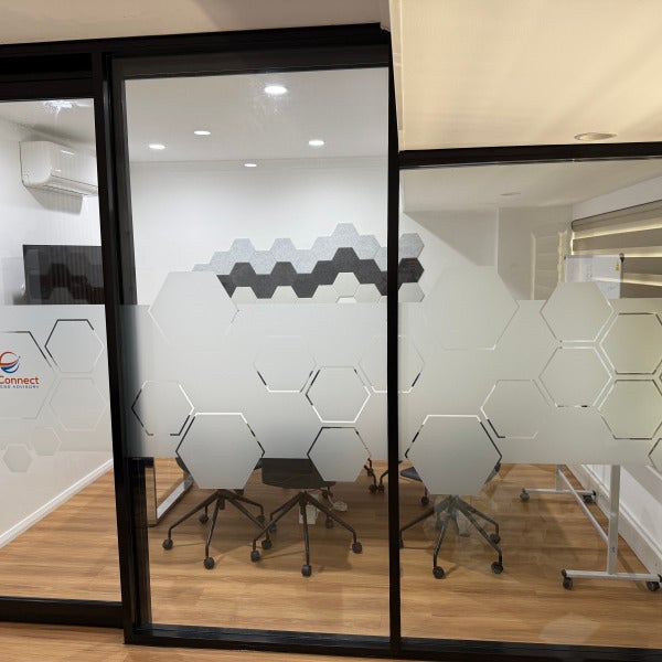
Creative Office Frosting & Printed Signage for WeConnect – West Perth
31 Dec 2025 by Michael McHugh
When it comes to office privacy, frosting doesn’t have to mean plain, boring or generic.
We recently partnered with WeConnect Business Advisory in West Perth to deliver a modern frosting and signage solution that balances privacy, branding and visual impact — and showcases just how creative window frosting can be.
More Than Just Privacy
For WeConnect, the goal was clear:
Maintain privacy for meeting rooms and workspaces
Create a polished, professional look
Subtly reinforce their brand throughout the office
Rather than a standard frosted band, we designed a custom geometric pattern that flows seamlessly across internal glass partitions. The result is a clean, contemporary aesthetic that feels intentional and well considered — not an afterthought.
The Part Most People Don’t Know… You Can Print on Frosting
One of the biggest misconceptions about window frosting is that it has to stay grey or etched.
In reality, you can print full colour graphics and logos directly over frosting — and that’s exactly what we did for WeConnect.
Their logo and branding elements were printed over the frosted film, allowing the glass to:
Retain privacy
Carry colour and brand identity
It’s a simple detail that makes a huge difference, and it’s something many businesses don’t realise is possible.
A Smart, Cost-Effective Branding Upgrade
Frosted window graphics are one of the most versatile and cost-effective ways to upgrade an office:
No structural changes
Minimal disruption during install
Fully customisable designs
Easy to update as brands evolve
For WeConnect, the finished result delivers privacy where it’s needed, while reinforcing their brand in a subtle, professional way.
If you’re planning an office refresh, don’t underestimate what frosting can do. With the right design, it becomes a powerful branding tool — not just a privacy solution.
At Signarama Osborne Park, we help businesses turn functional signage into something memorable.
Read more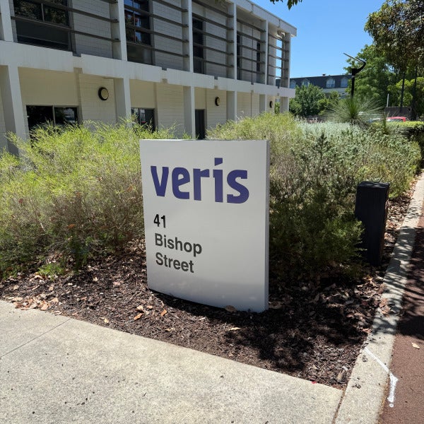
A Smart Signage Refresh for Veris Group
26 Dec 2025 by Michael McHugh
Sometimes, the smartest signage solution isn’t a full replacement — it’s a well-executed refresh.
We recently worked with Veris Group to revitalise their existing pylon sign at 41 Bishop Street, giving it a clean, modern update while retaining the original structure.
Over time, the original vinyl had begun to fade and no longer reflected Veris’ current brand standards. Rather than replacing the entire sign, the team opted for a re-skin, updating the vinyl to align with their refreshed brand colour — blue — and restoring the sign’s visual impact.
What We Did
Removed the existing, weathered vinyl
Applied new high-quality vinyl in Veris’ updated brand blue
Refreshed the overall appearance while retaining the existing pylon structure
The result is a crisp, professional sign that feels new again — without the cost or waste of a full replacement.
This project is a great example of how small upgrades can deliver big impact, extending the life of existing signage while keeping your brand looking sharp and current.
If your signage is structurally sound but visually tired, a refresh may be all you need. Get in touch to find out how.
Read more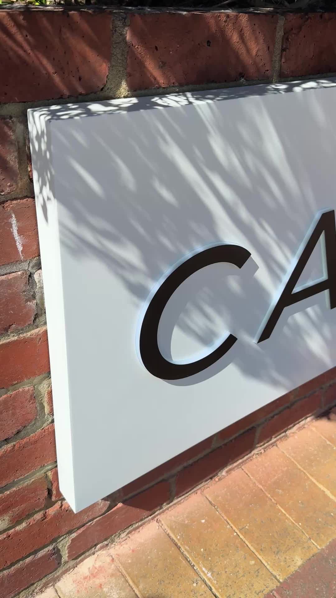
A Premium Signage Transformation for Canvas Cosmetic Clinic – North Perth
22 Dec 2025 by Michael McHugh
When Canvas Cosmetic Clinic prepared to open the doors to their new North Perth location, they wanted signage that felt confident, refined, and modern — while still complementing the character of the new offices.
At Signarama Osborne Park, we were proud to deliver a comprehensive signage package that brings clarity, consistency, and strong brand presence from the street right through to front door.
A Cohesive Brand Experience
The objective was clear: create signage that guides visitors effortlessly, reinforces trust, and reflects the polished, professional nature of the Canvas brand. The result is a clean, modern signage suite that balances visibility with elegance.
What We Delivered
Front Retaining Wall Lightboxes
We installed two ACM-faced lightboxes with push-through acrylic lettering, delivering a crisp illuminated finish that stands out day and night. These signs provide strong street presence while maintaining a sophisticated aesthetic.
Car Park Signage
A large ACM panel sign with black acrylic lettering clearly identifies the clinic and assists visitors as they arrive on site — practical, and on-brand.
Entry Fascia Signage
Above the main entry, we installed 20mm black acrylic “CANVAS.” lettering, creating a bold yet refined focal point that anchors the building frontage and elevates the overall presentation.
Directional & Wayfinding Signs
Several discreet but highly effective directional signs were installed throughout the site, ensuring visitors feel confident and supported from the moment they enter the property.
The Result
The finished signage delivers a seamless brand experience — premium, welcoming, and highly functional. Most importantly, the Canvas Cosmetic Clinic team was thrilled with the outcome, praising both the visual impact and the clarity the signage provides for their clients.
If you’re planning a new location or want your signage to reflect the quality of your brand, our team would love to help.
Read more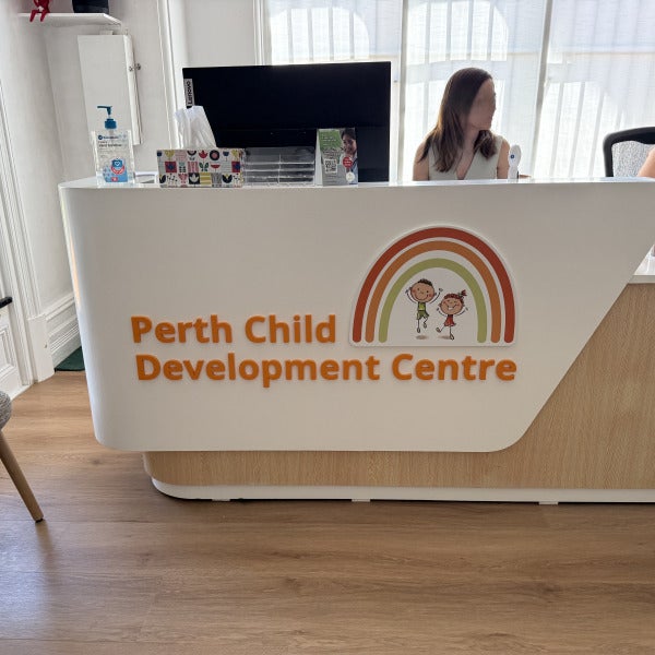
Creating a Welcoming First Impression for Perth Child Development Centre
19 Dec 2025 by Michael McHugh
At Signarama Osborne Park, we believe signage is about more than visibility — it’s about creating confidence, comfort, and connection from the very first moment someone arrives.
We were proud to partner with Perth Child Development Centre (Perth CDC) to deliver a cohesive signage package that reflects their caring, professional, and family-focused approach to developmental support.
A Consistent Brand Experience — Inside and Out
Perth CDC wanted signage that was clear, welcoming, and aligned with their brand values, while respecting the heritage character of their new offices in West Perth. The result is a calm, friendly visual presence that supports both wayfinding and trust.
What We Delivered:
External Building Plaque
Installed at the main entry, this clean and understated wall sign ensures visitors can easily identify the centre while maintaining a warm, approachable aesthetic.
Street-Facing Sign
Positioned for strong visibility from the footpath, this fabricated steel frame with ACM panel sign clearly communicates Perth CDC’s brand, purpose, and contact details — helping families feel confident they’re in the right place before they even step inside.
Internal Reception Desk Signage
Inside, we installed 10mm Painted Acrylic lettering and logo to the reception desk, creating a professional yet friendly focal point. This internal signage reinforces brand consistency and immediately sets a reassuring tone for families and children.
Designed with Care:
Every element of this project was designed and installed with sensitivity to Perth CDC’s mission — creating an environment that feels safe, supportive, and welcoming for families seeking developmental services.
We’re proud to have played a small part in helping Perth CDC present a space that reflects the incredible work they do every day.
If you’re looking to refresh your signage or create a consistent brand experience across your space, our team would love to help.
Signarama Osborne Park
08 9443 3663
Read more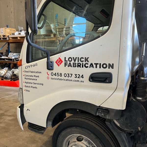
A Strong New Look for Lovick Fabrication: 12-Vehicle Fleet Branding Completed
12 Dec 2025 by Michael McHugh
When Lovick Fabrication approached us to refresh and unify the look of their vehicle fleet, our team was ready to deliver a high-impact visual solution that showcased their brand with professionalism and consistency. We’re excited to share that the full project is now complete — 12 vehicles fully branded, including single cabs, dual cabs, and trucks.
Building a Consistent, Professional Fleet Presence
Lovick Fabrication specialises in steel fabrication, concrete plant maintenance, agitator servicing, batch plants, and silo work. Their teams travel across worksites daily, making their vehicles an important touchpoint for visibility and reputation. Our goal was to create a design that communicates strength, reliability, and capability — the exact qualities their clients depend on.
Across all vehicle types, we ensured:
Consistent logo placement for maximum visibility
Clear service listings to showcase their capabilities at a glance
Clean typography and layout to maintain a professional appearance
Durable, high-quality materials suitable for worksite conditions
Each vehicle type required a tailored approach to ensure the branding fit the available space while maintaining balance and readability. Whether it was the aluminium toolboxes on the utes or the larger doors and panels of the trucks, every graphic was measured, positioned, and applied with precision.
Why Fleet Branding Matters
A well-branded fleet transforms every job site and road journey into a marketing opportunity. For Lovick Fabrication, their newly refreshed vehicles now:
Reinforce trust and professionalism with clients
Increase brand visibility across regional and metro areas
Present a unified, modern identity across all divisions
Demonstrate pride in workmanship — both in their industry and ours
A Project We Are Proud Of
Working with Lovick Fabrication has been a pleasure, and we’re proud to support a business that values quality and strong presentation as much as we do. Their fleet now stands as a mobile extension of their brand — bold, reliable, and built to last.
If your business is ready to elevate its fleet with professional signage, wraps, or rebranding, our team is here to help.
Get in touch today to start your next project.
Read more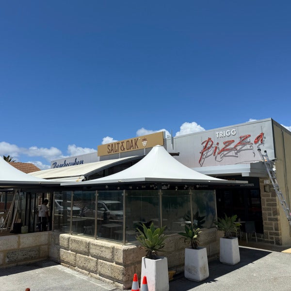
Transforming the Look of North Beach’s Newest Café – Salt & Oak
9 Dec 2025 by Michael McHugh
We were excited to partner with Salt & Oak, the fresh new café bringing great food and coastal charm to North Beach. Our team was engaged to enhance their street presence and help establish a strong visual identity from day one—and the results speak for themselves.
A Fresh New Pylon Sign
The existing roadside pylon sign needed a modern, clean update. We produced and installed a high-quality replacement digital print, designed to complement Salt & Oak’s branding while ensuring excellent visibility for passing traffic. The refreshed sign ties in seamlessly with the neighbouring businesses and gives the café instant recognition from the street.
6.5 Metre Custom Lightbox with Push-Through Acrylic Letters
The hero of the project is the impressive 6.5-metre lightbox we installed across the shopfront fascia. Built for longevity and maximum visual impact, this lightbox features:
Precision-cut push-through acrylic letters
Even, vibrant internal illumination
Durable aluminum construction designed for coastal conditions
By day, the signage presents crisp, bold branding. By night, the push-through acrylic comes to life with a clean, modern glow—making Salt & Oak impossible to miss.
A Thrilled Client and a Standout Result
The team at Salt & Oak was thrilled with the final product, and we’re proud to have played a part in bringing their new venue to life. Thoughtfully designed signage doesn’t just look great— it drives visibility, builds brand recognition, and helps new businesses make a strong first impression.
Salt & Oak is now perfectly positioned to welcome customers with a look that matches the quality of their offering.
Read more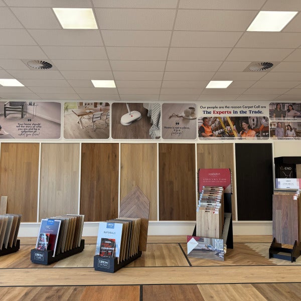
Project Spotlight: Carpet Call Ellenbrook – Full Store Graphics & Signage Install
4 Dec 2025 by Michael McHugh
We’re proud to showcase our latest full-scale signage and graphics installation for the brand-new Carpet Call Ellenbrook store!
Our team delivered a complete visual transformation, including:
Internal wall graphics – Large-format branded digital print lifestyle imagery, product categories, expert messaging, and in-store guidance for customers.
Massive rug gallery signage – Clean, bold visuals that elevate the shopping experience and make navigation effortless.
Window graphics & external branding – High-impact frontage digitally printed oneway vision, showcasing Carpet Call’s services, packages, and “shop at home” offer, designed to attract customers from the moment they arrive.
Product information displays – Including rug sizing guides, category panels, and sectional signage that ties the entire store together.
From concept to installation, this project shows what high-quality visual communication can do for a retail environment—clear branding, immersive customer experience, and a polished, professional store fit-out.
Location: Carpet Call – Ellenbrook
Scope: Full internal wall graphics + external window signage
A huge thank-you to Carpet Call for trusting us with this new store!
Want to refresh your retail space or planning a new fit-out? Let’s bring your brand to life.
Read more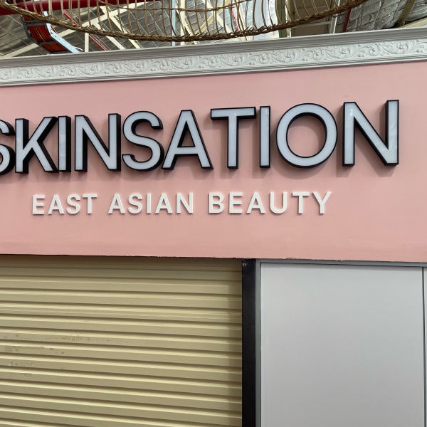
A Stunning First Impression: Face-Lit Illuminated Signage for Skinsation’s First Store
28 Nov 2025 by Michael McHugh
When a brand opens its very first retail location, every detail matters — especially the signage. It’s the customer’s first interaction with the business, the visual handshake that communicates identity, style, and professionalism. We were thrilled to help Skinsation, a new East Asian beauty retailer, bring their brand to life with a custom face-lit illuminated sign that truly stands out.
Bringing the Skinsation Brand to Life.
Skinsation’s vision was clear: a clean, modern aesthetic that reflects the elegance and serenity associated with East Asian beauty culture. Their signature soft-pink storefront set the tone, and our signage needed to complement it while delivering maximum visibility.
We crafted a face-lit illuminated sign featuring bold 3D lettering with a sleek black trim — a perfect contrast against the pastel backdrop. The illumination ensures the brand shines both day and night, drawing attention without overwhelming the minimalist feel of the space.
Why Face-Lit Signs Were the Perfect Choice
Face-lit illuminated letters were selected for Skinsation’s first store because they offer:
High visibility
Bright, LED illumination ensures the store remains eye-catching in any lighting condition.
Premium aesthetics
The clean glow of face-lit lettering adds a modern, professional look — ideal for beauty and retail brands.
Strong brand presence
The large, bold SKINSATION lettering gives the storefront confidence and authority, essential for a new business entering a competitive market.
Long-lasting durability
High-quality materials and energy-efficient LEDs mean the signage will continue performing beautifully for years to come.
A Proud Moment for a Brand’s First Step
Opening a brand’s first store is a milestone, and we’re proud to have played a part in Skinsation’s journey. Their illuminated signage now sets the tone for the entire retail experience — elegant, welcoming, and unmistakably premium.
From concept to installation, our goal was to deliver a sign that not only met the brief but elevated the space. Seeing it glowing above their storefront is a rewarding reminder of why we do what we do.
Read more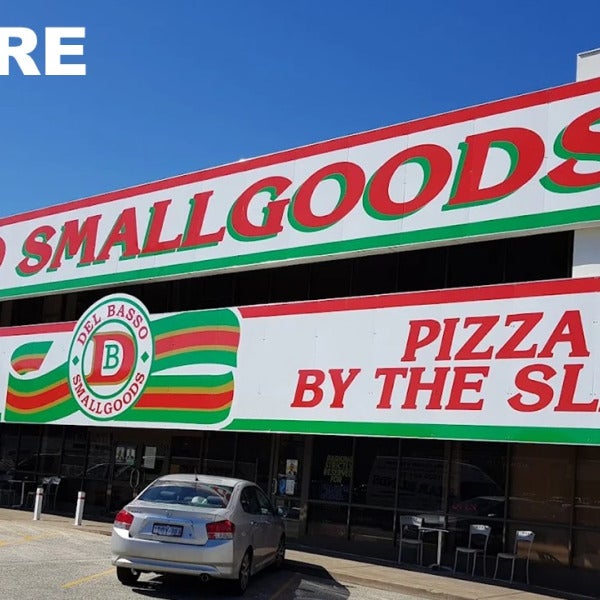
A Bold New Era: From Del Basso Smallgoods to European Smallgoods — A Complete Signage Transformation by Signarama Osborne Park
24 Nov 2025 by Michael McHugh
Osborne Park has long been home to some truly iconic local businesses — and few are as well-known as Del Basso Smallgoods, proudly established in 1957. For decades, their vibrant red, green, and white signage was instantly recognisable to locals and visitors alike.
But with a major rebrand to European Smallgoods, the team set out to refresh their identity — something modern, premium, and aligned with their evolving brand direction. And that’s where we stepped in.
At Signarama Osborne Park, we were thrilled to partner with the European Smallgoods team to bring their new vision to life with a complete exterior signage transformation.
Before: The Classic Del Basso Look
Bright, traditional, and unmistakably Del Basso.
Their original signage had served the brand faithfully for many years, but the rebrand called for a more refined and contemporary visual identity to match the next chapter of their business.
After: A Premium New Identity with 3D Signage
The new 20mm exterior-grade PVC 3D letters with gold vinyl deliver a bold and striking step into the future. The updated façade features:
A sleek black and gold colour palette
Strong, dimensional lettering for maximum street presence
A clean, modern layout that elevates the European Smallgoods brand
A cohesive, premium exterior built for longevity
The transformation completely re-energises the appearance of the building while still honouring the heritage of this long-standing family business.
A Transformation We’re Proud Of
Working with a business that has been part of the community since 1957 was a privilege.
Collaborating with the European Smallgoods team to design, produce, and install this new signage package was an incredible experience — and watching the transformation take shape has been a highlight for our entire Signarama Osborne Park team.
Seeing the final result standing proudly on their Osborne Park site is something we are truly proud of.
This project perfectly showcases how powerful signage can be in redefining a brand’s presence while respecting its history.
If your business is planning a rebrand or needs a signage refresh, we’d love to help bring your vision to life too.
Signarama Osborne Park — Bringing Brands to Life.
Read more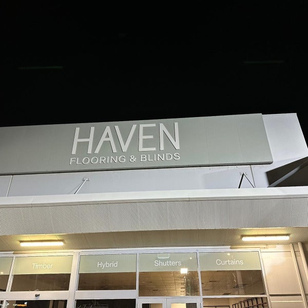
Haven Flooring & Blinds Midland: Another Successful Signage Project Completed
20 Nov 2025 by Michael McHugh
Haven Flooring & Blinds have opened the doors to their brand-new Midland showroom — and we were proud to once again deliver a full suite of signage to bring their brand to life.
After completing the signage package for Haven’s first store earlier this year, our team was thrilled to be invited back to handle the complete signage rollout for their new Midland location. This second project reflects the strong relationship built with the Haven team and their trust in our ability to deliver quality, consistency, and speed.
A Cohesive Brand Presence From Street to Showroom.
The new Midland showroom required a combination of external and internal signage to ensure visibility from the road, strong brand recognition and a polished in-store customer experience.
Here’s what we delivered:
Pylon Sign
We refreshed and installed the updated pylon panel featuring the Haven Flooring & Blinds branding. Positioned along a busy road, this sign gives the new store excellent visibility—day or night.
Internal 3D Acrylic Wall Sign
To elevate the showroom environment, we installed a premium 3D acrylic wall sign, the result is a clean, modern centrepiece that welcomes customers the moment they walk in.
Window & Category Strip Signage
The storefront was completed with sleek window oneway vision showcasing Haven’s key product categories including carpet, timber, hybrid flooring, curtains, and shutters. These strips help customers understand the full range of services before they even step inside.
External 3D Fascia Signage
The large fascia sign creates bold street-front presence and unifies the building façade with strong presence using 20mm Exterior Grade PVC. It’s simple, clear, and highly visible from distance.
Sail Track Banner Sign
To maximise exposure to carpark traffic, we installed a custom sail track banner sign along the side boundary wall. This gives the brand additional reach and exposure across the entire complex.
Quality, Consistency & Brand Integrity
Every piece of signage was carefully produced, and installed to ensure perfect alignment with Haven Flooring & Blinds’ growing brand. With two stores now completed, Haven’s retail identity is strong, cohesive, and instantly recognisable.
We’re proud to support their expansion and look forward to being part of their future growth.
Thinking About Upgrading Your Business Signage?
Whether it’s a full signage package or a simple refresh, our team can help bring your brand to life with professional design, fabrication, and installation.
Get in touch to discuss your next project.
Read more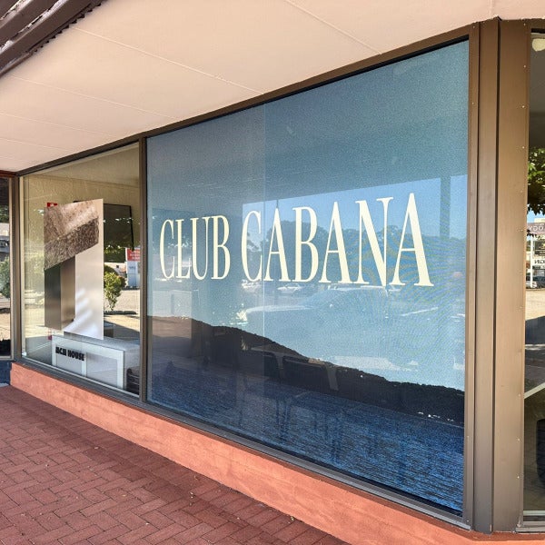
MCM House Claremont – Window Graphics & Pylon Signage
14 Nov 2025 by Michael McHugh
MCM House has officially opened in Claremont, bringing their signature relaxed coastal style to the west. To support the store launch, we were engaged to create both window graphics and an updated pylon panel that would reflect the brand’s understated, natural aesthetic while still standing out clearly from the street.
Window Signage Using One Way Vision Film
The corner frontage offered a strong opportunity for visual impact. Rather than leaving the windows open or using opaque frosting, we printed and installed One Way Vision window film. This allows customers and staff inside to still enjoy outward visibility, while presenting a full, seamless graphic face to passers-by.
The creative for the windows showcased the “CLUB CABANA” campaign imagery, featuring earthy textures and coastal tones that align beautifully with MCM House’s design style.
Benefits of One Way Vision in retail street frontage:
Full-colour visual impact from the exterior
Maintains natural light inside the store
Adds privacy without feeling closed off
Ideal for campaign imagery, long-term branding or seasonal themes
The result is a storefront that feels premium, inviting, and unmistakably on-brand. Even at a glance, the windows communicate exactly what customers can expect when they step inside: warmth, texture, and thoughtful design.
Pylon Sign Update with Acrylic Panel & Vinyl Cut Lettering
Along the roadside, we produced a white acrylic insert panel for the existing pylon structure, finished with clean vinyl cut lettering. This style is sleek, minimal and architectural — complementing the exterior landscaping and the broader design language of the precinct.
Acrylic panel offers a smooth, high-quality surface
Vinyl cut lettering provides sharp edges and a modern, timeless look.
The pylon now clearly signals MCM House’s presence without overwhelming the aesthetic of the location — confident, but not loud.
Final Look & Feel
The combination of textured One Way Vision window graphics and the crisp white-and-black pylon sign creates a cohesive brand story from first glance to entry. It supports visibility, wayfinding, and identity — all while staying true to MCM House’s calm and considered style.
If your business is opening a new store, rebranding, or simply wanting to refresh your frontage, our team can help guide you on material selection, visual layout, and signage strategy to get the best balance of presence and design.
Get in touch to chat signage for your next project.
Read more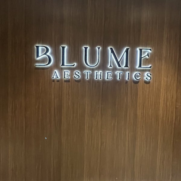
Illuminating Beauty: Signarama Osborne Park’s Custom Signage for Blume Aesthetics
10 Nov 2025 by Michael McHugh
Brand presentation sets the tone long before a client walks through the door. When Blume Aesthetics approached us to create their signage, they were looking for something that felt refined, welcoming and consistent with the calm confidence of their clinic. Together, we developed a signage solution that not only stands out, but truly reflects the Blume experience from the street front all the way into reception.
Elevating the Exterior Presence
For the exterior signage, Blume opted for stainless steel channel letters with an illuminated acrylic face. This gives the front fascia a clean, modern appearance during daylight hours and a sophisticated glow after dark.
The illuminated acrylic face creates clear visibility while maintaining elegance, ensuring the signage is both eye-catching and aligned with the brand’s style. It’s the kind of sign that does its job quietly and confidently, drawing attention without overpowering the building facade.
A Warm & Luxurious Welcome Indoors
Inside the clinic, the goal was to create a sense of calm and care the moment clients step through the door. For the reception feature wall, Blume chose a different style of illumination:
stainless steel black-face channel letters that are backlit with opal acrylic to create a soft halo glow.
This technique gently washes light around each individual letter, resulting in a warm, inviting shimmer rather than a direct brightness. It complements the natural timber feature wall and adds depth and ambience to the space. The halo effect enhances the feeling of relaxation and refinement that Blume Aesthetics is known for.
Design, Craftsmanship & Installation
Our team managed the project from design concept to final installation.
Collaboration
Working with Blume Aesthetics has been a rewarding project — the kind that reminds us why signage matters. The right signs don’t just label a space. They shape experience.
They create a moment. They set the tone.
If your business is ready to elevate its visual presence — inside, outside, or both — Our team at Signarama Osborne Park would love to help bring your vision to light.
Read more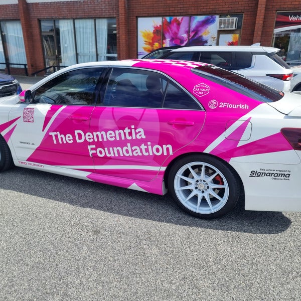
Raising Awareness in Motion: The Dementia Foundation Rally Car Wrap
3 Nov 2025 by Michael McHugh
At Signarama Osborne Park, we love when our craft helps drive a meaningful cause—literally! Our team recently had the privilege of designing and installing a full vehicle wrap for The Dementia Foundation, proudly supporting their signature event, The Big Lap.
A Design That Speaks Volumes
The brief was clear: create something that turns heads, sparks conversation, and represents the Foundation’s mission to bring awareness and support to those living with dementia and their families. The result? A striking pink and white wrap that’s as bold as the message it carries.
The car—a Toyota TRD Aurion—features:
The Dementia Foundation’s logo and branding, seamlessly integrated into a dynamic, modern design.
A large, multi-colored awareness ribbon on the bonnet—a universal symbol of support and compassion.
Partner recognition for Pentanet, Car Vault 365, 2Flourish, and of course, Signarama Osborne Park for the wrap production and installation.
QR codes that allow passersby to instantly learn more or donate to the cause.
Every detail was precision-fitted by our installation team, ensuring a professional finish that will last through The Big Lap’s demanding journey around Australia.
About The Big Lap
The Big Lap is The Dementia Foundation’s flagship fundraising event, where participants embark on an epic road trip across Australia to raise awareness and funds for dementia research and support initiatives. It’s more than a rally—it’s a movement of people united to make a difference.
You can read more about this inspiring initiative or make a donation directly via their official page: https://tdfwa.org.au/the-big-lap-our-signature-event/
Driving Awareness, One Kilometer at a Time
We’re proud to have played a small part in helping this important cause stand out on the road. Projects like this remind us that signage isn’t just about visibility—it’s about connection, community, and creating impact.
If you’d like to transform your vehicle or fleet into a moving billboard for your business or cause, visit Signarama Osborne Park. Together, we can make your message impossible to miss.
Read more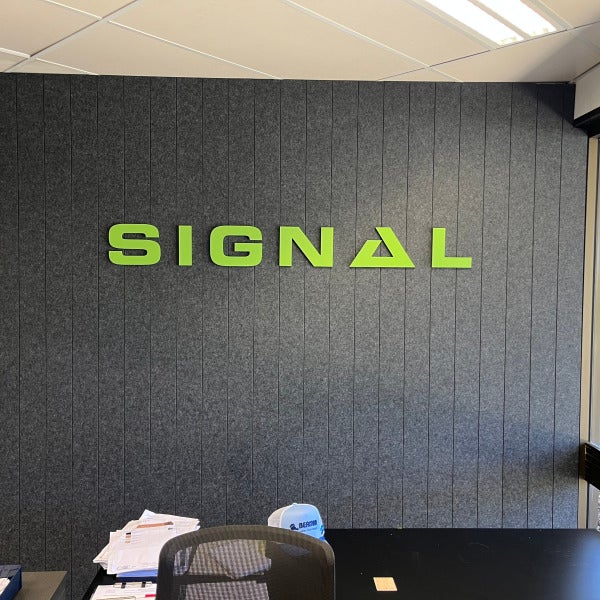
Fresh, Modern Reception Signage for Signal and Tii
27 Oct 2025 by Michael McHugh
We recently completed a new reception signage installation for Signal and Tii, featuring 3D 10mm acrylic painted lettering that delivers a clean, modern look with strong brand presence.
The Signal logo was crafted from precision-cut acrylic, painted in a vibrant green corporate colour that stands out beautifully against the dark acoustic panel fascia. Perfect for a contemporary office environment.
For Tii, the logo was created in white acrylic, adding a touch of sophistication to the timber-and-black reception counter. Together, these elements create a professional and welcoming first impression for visitors and customers.
From design to installation, our team ensured every detail aligned with the client’s branding and interior aesthetic — a seamless blend of craftsmanship and creativity.
Read more
Signarama Osborne Park
1/135 Hector Street West
Osborne Park Western Australia 6017
[email protected]. We will be closed for the Christmas break Thursday 25th Dec-11th Jan 2026.
Opening Hours:
Monday
8:00 am - 4:00 pm
Tuesday
8:00 am - 4:00 pm
Wednesday
8:00 am - 4:00 pm
Thursday
8:00 am - 4:00 pm
Friday
7:00 am - 3:00 pm
contact
Signarama Osborne Park
CLIENTS WE HAVE WORKED WITH: