

Signarama Osborne Park

Signarama Osborne Park

Your local team for quality signs.

New Location Signage for Workforce Extensions

New Location Signage for Workforce Extensions

Feb 24, 2026 by Michael McHugh
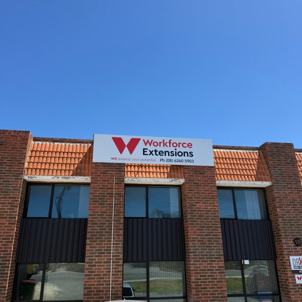
We recently completed a full signage project for the new Workforce Extensions location, delivering a clean, professional result that reflects their brand and improves visibility for staff, clients, and visitors. From the outset, this project was a collaborative process. We worked closely with the Workforce Extensions team to fine-tune their signage design, ensuring it aligned perfectly with their existing branding while also suiting the architecture and layout of the new building. Design Collaboration & Refinement Every site comes with its own challenges, and this location was no different. Together with the client, we: Reviewed sizing, placement, and sightlines Adjusted layouts to maximise street and car-park visibility Ensured brand consistency across all signage elements This collaborative approach allowed us to move confidently from concept to production, knowing the final outcome would meet both branding and practical requirements. ACM Panel & Directional Signage For this project, we supplied and installed: ACM panel signs for the main building façade, providing a sharp, modern finish with excellent durability Directional signage to clearly guide visitors and improve wayfinding around the site ACM panels were the ideal choice for this installation, offering a sleek appearance, long-term weather resistance, and a professional corporate look that complements the brickwork of the building. Production & Installation Once the design was signed off, our team handled the full production and installation process, ensuring: High-quality print and finishing Precise installation and alignment A seamless, hassle-free experience for the client The result is a strong visual presence that clearly identifies the new Workforce Extensions location and reinforces their brand from first glance. A Great Result for a New Location We’re proud to have supported Workforce Extensions with signage that helps launch their new site with confidence. Projects like this highlight the value of clear communication, thoughtful design, and quality materials from start to finish. If you’re planning signage for a new location, relocation, or brand refresh, we’d love to help bring your vision to life.
Read more
Diversified Brand Refresh – From Concept to Completion

Diversified Brand Refresh – From Concept to Completion

Feb 20, 2026 by Michael McHugh
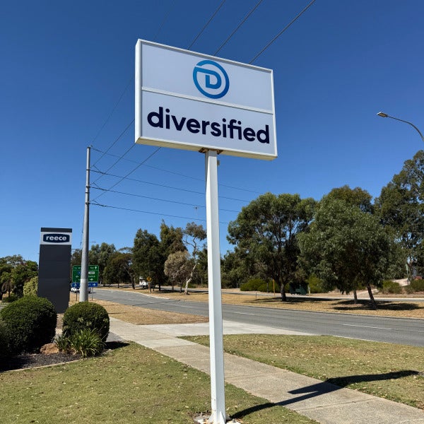
We recently completed a new location signage package for Diversified, delivering a clean, modern finish that strengthens maximizes street presence and reinforces brand consistency across the site. This project was a true end-to-end collaboration, with our team working closely with the client from the initial concept development right through to final installation. Scope of Works For this upgrade, the focus was on creating a cohesive, professional look that would stand out from the road while tying the building and pylon signage together seamlessly. The completed works included: ACM fascia panels We supplied and installed high-quality Aluminium Composite Material (ACM) panels to the building fascia, with digitally printed graphics providing a sleek, durable finish that forms the foundation of the refreshed branding. Custom window graphics Designed to complement the new fascia signage, the window graphics enhance visibility while maintaining a clean and professional aesthetic from both inside and out. Replacement pylon lightbox graphics The existing pylon sign was revitalised with new lightbox graphics, ensuring strong day and night visibility and consistent branding for passing traffic. Collaborative Design Approach A key part of this project’s success was the close collaboration with the Diversified team. We worked side-by-side with the client to: Develop the initial design concept Refine layouts, colours, and finishes to suit the site Ensure all elements aligned with brand guidelines Deliver a solution that was both functional and visually impactful This hands-on approach allowed us to move smoothly from design to production, ensuring there were no surprises during installation. The Result The finished signage delivers a bold, modern presence that elevates the overall look of the premises. With crisp ACM panels, well-integrated window graphics, and a refreshed pylon sign, Diversified now benefits from: High roadside visibility Strong brand consistency A professional, future-proof signage solution If you’re considering a signage refresh or a full brand rollout—from concept and design through to manufacture and installation—we’d love to help bring your vision to life.
Read more
From Wright Real Estate to Seabreeze Realty: A Fresh Coastal Rebrand Brought to Life

From Wright Real Estate to Seabreeze Realty: A Fresh Coastal Rebrand Brought to Life

Feb 9, 2026 by Michael McHugh

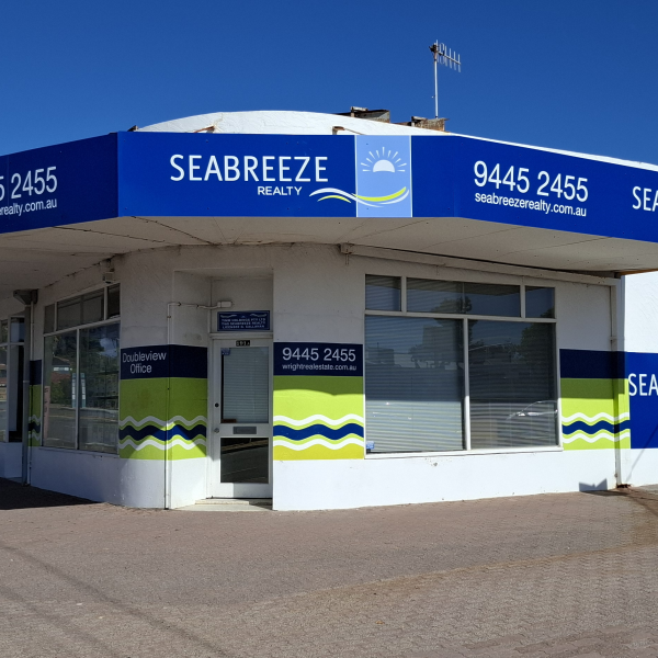
We recently partnered with Wright Real Estate to deliver a complete signage transformation as they relaunched their brand as Seabreeze Realty. The goal was clear: create a modern, coastal identity that reflected their values while making a strong visual impact in a high-traffic location. A bold new identity on a landmark corner site the Doubleview office sits on a prominent corner position, making visibility and consistency critical. We worked closely with the Seabreeze Realty team to ensure the new branding was clean, confident, and instantly recognisable from every angle. The exterior upgrade included: Full awning signage wrapping the building perimeter High-contrast blue panels with crisp white text Integrated logo elements reinforcing the coastal “Seabreeze” theme Clear contact details positioned for maximum street exposure The result is a sharp, professional street presence that stands out without overwhelming the building’s architecture. Consistency from street to reception a successful rebrand doesn’t stop at the shopfront. Inside the office, we continued the visual language with a custom reception sign that ties seamlessly into the exterior branding. This internal signage: Reinforces brand recognition the moment clients walk in Creates a polished, professional first impression Aligns staff, space, and brand under one cohesive look. Every detail was designed to ensure the Seabreeze Realty experience feels consistent and intentional. Rebrands like this matter because branding plays a major role in trust and perception. This rebrand helped Seabreeze Realty: Clearly signal a new chapter in their business Increase local visibility and brand recall Present a fresh, modern image aligned with their market Strong signage turns a name change into a statement — and this project is a perfect example of that. If you need help with your signage re-brand and don't know where to start contact us today.
Read more
Fresh Fleet Branding: Sealwerx WA Van Signage Complete

Fresh Fleet Branding: Sealwerx WA Van Signage Complete

Feb 6, 2026 by Michael McHugh

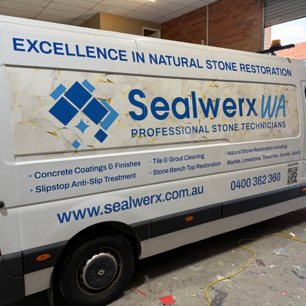
We recently completed two van signage projects for Sealwerx WA – Professional Stone Technicians, and the result is a clean, premium look that perfectly reflects the quality of their work. Sealwerx WA specialise in natural stone restoration, so it was important the design communicated trust, professionalism, and craftsmanship at first glance. There new vans will be out on the road daily, acting as a mobile billboard — so clarity and impact were key. Design That Reflects the Trade The brief was clear: Professional Easy to read High-end finish We used a marble-inspired design to subtly reference natural stone, paired with strong blue branding to ensure excellent contrast and legibility. The layout keeps the brand name front and centre, with supporting services clearly listed without cluttering the design. Key elements include: Large, bold Sealwerx WA branding for instant recognition Clear service listings, including stone restoration, tile & grout cleaning, and anti-slip treatments Website, phone number, and QR code for quick customer contact Accreditation logos to reinforce credibility and compliance Built for bold Visibility on the Road This design, covering both sides and the rear doors to maximise exposure from every angle — whether parked on-site or driving through traffic. The consistent design across all panels ensures the branding looks sharp and professional no matter where it’s viewed. Another Mobile Billboard, Done Right Fleet signage is one of the most cost-effective forms of advertising, and this van now works for Sealwerx WA every time it hits the road. Clean, durable, and eye-catching — exactly what you want from commercial vehicle signage. A big thanks to Sealwerx WA for trusting us with their branding. We’re proud to see this one rolling around WA. If you’re considering van signage, vehicle signage for your fleet, get in touch with us to see how we can help your business stand out.
Read more
The Mobility Store Van Signage Project

The Mobility Store Van Signage Project

Jan 31, 2026 by Michael McHugh

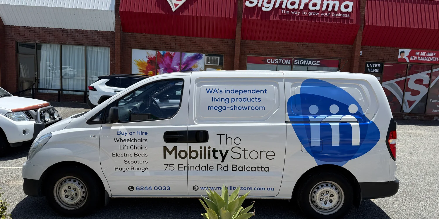
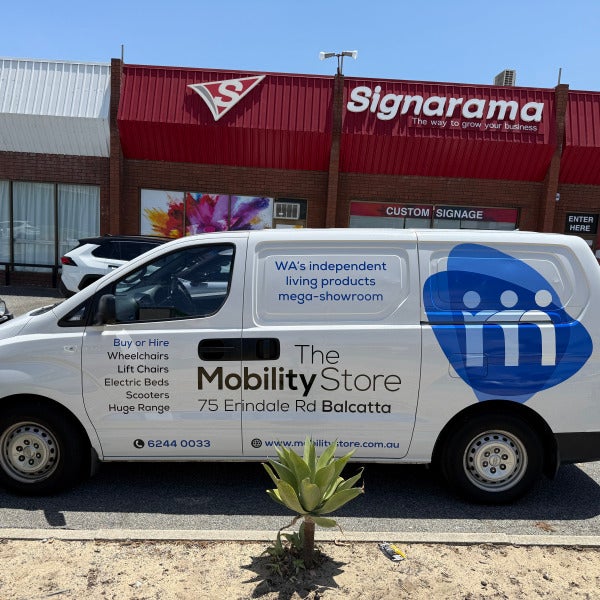
We recently completed this full van signage project for The Mobility Store, and the result is a clean, professional mobile billboard that works just as hard as their team does on the road. Clear Message. Strong Presence. This van was designed to be instantly recognisable and easy to read in real-world conditions, such as driving in traffic and car parks. The bold blue Mobility Store logo dominates the sides and rear, ensuring brand recognition from every angle, while the white base keeps the overall look fresh and approachable. Designed for Real Customers The copy layout was carefully considered to speak directly to the people who matter most: “WA’s independent living products mega-showroom” sets authority and scale Clear Buy or Hire messaging highlights flexibility Product categories like wheelchairs, lift chairs, electric beds, and scooters are listed for fast understanding. Contact details and website are placed where they’re easy to find when the van is parked or stopped at lights. No clutter. No confusion. Just straight-up clarity. A Mobile Showroom That Works 24/7 This signage transforms the van into a moving extension of The Mobility Store’s Balcatta showroom. Whether it’s parked outside a customer’s home, driving through industrial areas, or sitting in traffic, it’s constantly reinforcing trust, professionalism, and accessibility. Built to Last Printed and installed using high-quality materials, this vehicle signage is designed to handle daily use while keeping colours sharp and finishes clean. It’s not just about looking good on day one—it’s about still looking great years down the track. If you need vehicle signage but are unsure on where to start, call our team today.
Read more
Lotterywest Roster & Bollard Signage

Lotterywest Roster & Bollard Signage

Jan 29, 2026 by Michael McHugh

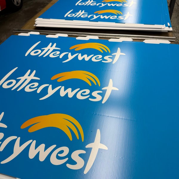
We recently completed a high-impact signage project for Lotterywest, producing 100 roster signs and 100 bollard signs designed to work hard at street level. This job is a great example of how simple, well-designed signage can punch well above its weight when it comes to visibility, brand reinforcement, and foot traffic. The Brief Lotterywest needed signage that was: Highly visible in busy retail locations Consistent with brand guidelines Durable but cost-effective Quick to deploy across multiple sites The solution? A combination of Corflute roster signs and bollard covers — two of the most effective tools for brand exposure or specific call to actions. The Solution Roster Signs (Corflute) Corflute roster signs are a staple for a reason. They’re: Easy to install and remove Lightweight yet durable Cost-effective for large rollouts Ideal for directional messaging and promotions By using bold brand colours and clear layouts, these signs ensure staff and customers alike always know what’s on, where to go, and what to look for. Bollard Signs Bollard signage is one of the most underrated marketing assets in retail. Placed right at the point of entry, bollard signs: Capture attention before customers even step inside Reinforce brand recognition instantly Guide foot traffic naturally and intuitively In this case, the bright Lotterywest blue combined with clean arrows and logo placement creates an immediate visual cue that’s impossible to miss. Why This Works From a marketing perspective, this type of signage delivers serious value because it: Uses existing infrastructure (bollards) Requires no power or maintenance Is fast to produce and install Scales easily across dozens or hundreds of locations This is a low-cost, high-return way to stay front-of-mind and draw customers in. The Result With 200 signs rolled out, Lotterywest now benefits from: Stronger street-level presence Clearer wayfinding Consistent branding across multiple sites A practical signage solution that supports increased foot traffic Thinking About Bollard or Roster Signs? If you’re looking for a powerful and inexpensive way to boost awareness at your location, bollard and roster signage should be high on your list. This project is proof that smart design and quality Corflute signage can deliver big impact without big budgets.
Read more
Signage Project Spotlight: Ai Advancements, Osborne Park

Signage Project Spotlight: Ai Advancements, Osborne Park

Jan 25, 2026 by Michael McHugh
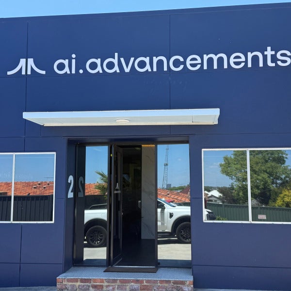
We recently completed a full signage package for Ai Advancements at their Osborne Park office, delivering a clean, modern look that aligns perfectly with their forward-thinking brand. This project combined exterior and interior signage elements to create a strong first impression for visitors while reinforcing brand values throughout the workspace. Exterior Fascia Signage – 3D White PVC Lettering For the building façade, we supplied and installed 3D white PVC lettering featuring the ai.advancements logo and wordmark. This style was chosen for its crisp finish, durability, and high contrast against the dark façade panels, ensuring excellent visibility from the street while maintaining a refined, professional aesthetic. Key benefits: Clean, modern appearance Weather-resistant PVC for long-term performance Strong brand visibility from first glance Reception Feature – 30mm Back-Lit Illuminated Lettering Inside the reception area, the focal point is a 30mm thick back-lit illuminated logo mounted on a feature wall. The soft halo glow adds depth and sophistication, creating a premium welcome experience for clients and visitors. This illuminated sign was carefully positioned and balanced to enhance the space without overpowering it—subtle, confident branding at its best. Internal Branding – Vinyl Wall Graphics To complete the interior fit-out, we installed custom vinyl wall graphics showcasing Ai Advancements’ core values: At the Forefront Collaborative Growth Deeply Invested Complete Integrity Fast Action These graphics not only bring visual interest to the workspace but also reinforce company culture for staff and visitors alike. A 5-Star Result Looking to Upgrade Your Office Signage? Whether it’s 3D lettering, illuminated signs, or branded wall graphics, we specialise in end-to-end signage solutions that make businesses stand out. If you’re planning a signage upgrade, we’d love to help bring your brand to life.
Read more
Bringing Biologic’s Brand to Life in Osborne Park

Bringing Biologic’s Brand to Life in Osborne Park

Jan 20, 2026 by Michael McHugh
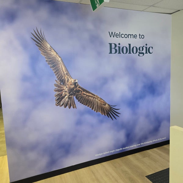
We recently had the pleasure of delivering a full-scope signage and graphics fit-out for Biologic at their new Osborne Park location — a project that blended creativity, function, and brand storytelling across the entire workplace. From the moment you arrive, it’s clear this is not a standard office environment. Every visual element was designed to reflect Biologic’s future-thinking, biodiversity-focused identity, while also making the space easy to navigate and enjoyable to work in. The journey starts outside with bold external 3D Logo and one-way vision graphics. These allow natural light to flow into the space while maintaining privacy and projecting Biologic’s brand to the street. The result is a clean, professional façade that clearly signals who Biologic are — before you even step through the door. Inside, the reception area features a custom 3D Biologic logo, creating a strong focal point and an immediate sense of arrival, reinforcing the brand in a way that feels premium and purposeful. This is where branding meets confidence — a reception space that feels welcoming, credible, and distinctly Biologic. Across the office, we installed custom glass frosting and meeting room graphics using coloured shapes inspired by nature and biodiversity. These graphics strike a careful balance between privacy and openness, allowing light to travel through the space while subtly defining rooms and functions. Each meeting room feels connected to the wider brand, without overwhelming the space — calm, modern, and thoughtfully designed. With a growing team and multiple work zones, clear navigation was essential. We delivered a comprehensive suite of directional and wayfinding signs, guiding staff and visitors effortlessly through labs, offices, meeting rooms, stairs, and exits. These signs don’t just function well — they visually integrate with the broader graphics system, keeping the environment consistent and intuitive. A Cohesive Signage Solution This project brought together by: Creative glass frosting and feature graphics Meeting room branding 3D reception signage 3D External building signage One-way vision window graphics Extensive internal directional signage All designed, produced, and installed to work as one cohesive visual system. The Result Biologic’s Osborne Park office is now a space that: Reflects their values and vision Supports day-to-day functionality Enhances staff experience Makes a strong impression on visitors It’s always rewarding to see a brand come to life across an entire workplace, and this project is a great example of how well-designed signage can transform a space. If you’re planning a new office, relocation, or refresh, and want your branding to work harder for you — we’d love to help call us on 08 9443 3663.
Read more
Welcoming a New Local Favourite: At Adels Café & Restaurant, South Perth

Welcoming a New Local Favourite: At Adels Café & Restaurant, South Perth

Jan 7, 2026 by Michael McHugh
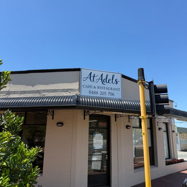
There’s something special about helping a new hospitality venue make its mark — and At Adels Café & Restaurant in South Perth is a perfect example of how thoughtful signage can set the tone from the very first glance. The team at At Adels wanted signage that felt elegant, welcoming, and timeless, while still being highly visible to passing foot traffic and vehicles. Our brief was to create a cohesive signage package that enhanced the building’s character and reflected the warmth of the dining experience inside. A Cohesive Signage Package — Inside and Out For this project, we delivered a mix of external branding and window treatments, designed to work together seamlessly. What we installed: Fascia Signage A clean, highly visible fascia sign positioned above the awning to clearly announce At Adels Café & Restaurant to the street. This ensures strong brand presence from multiple approach angles. Window Frosting with Logo Detail Frosted window film was applied to provide privacy for diners while still allowing natural light into the space. The gold logo overlay adds a refined, premium touch — a subtle detail that elevates the entire frontage. Front Door Signage & Trading Hours Gold vinyl lettering on the entry door clearly displays the brand and opening hours, delivering clarity and professionalism right at the point of entry. The Result The finished signage creates a polished, inviting street presence that complements the architecture of the building and reinforces At Adels’ brand identity. It’s understated, elegant, and designed to stand the test of time — exactly what you want for a new restaurant launchings. We’re proud to have partnered with the At Adels team and wish them every success as they welcome the South Perth community through their doors. If you’re opening a new venue or refreshing an existing one, our team would love to help bring your brand to life.
Read more
Creative Office Frosting & Printed Signage for WeConnect – West Perth

Creative Office Frosting & Printed Signage for WeConnect – West Perth

Dec 31, 2025 by Michael McHugh
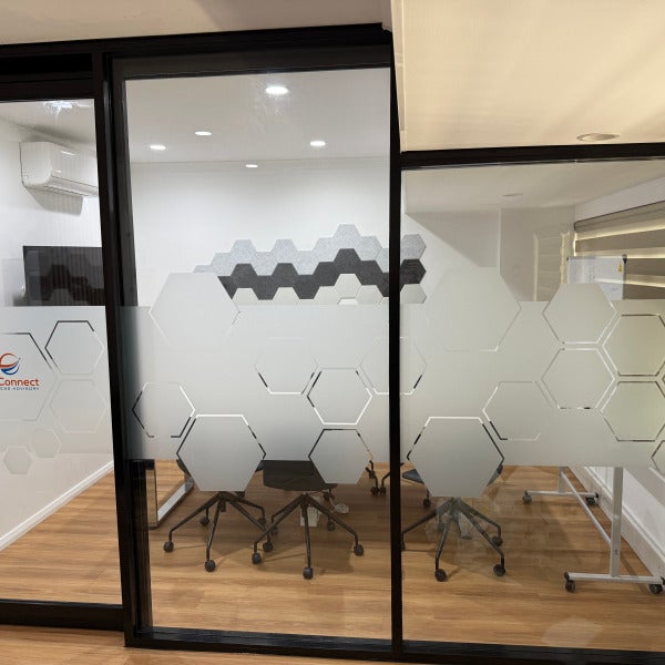
When it comes to office privacy, frosting doesn’t have to mean plain, boring or generic. We recently partnered with WeConnect Business Advisory in West Perth to deliver a modern frosting and signage solution that balances privacy, branding and visual impact — and showcases just how creative window frosting can be. More Than Just Privacy For WeConnect, the goal was clear: Maintain privacy for meeting rooms and workspaces Create a polished, professional look Subtly reinforce their brand throughout the office Rather than a standard frosted band, we designed a custom geometric pattern that flows seamlessly across internal glass partitions. The result is a clean, contemporary aesthetic that feels intentional and well considered — not an afterthought. The Part Most People Don’t Know… You Can Print on Frosting One of the biggest misconceptions about window frosting is that it has to stay grey or etched. In reality, you can print full colour graphics and logos directly over frosting — and that’s exactly what we did for WeConnect. Their logo and branding elements were printed over the frosted film, allowing the glass to: Retain privacy Carry colour and brand identity It’s a simple detail that makes a huge difference, and it’s something many businesses don’t realise is possible. A Smart, Cost-Effective Branding Upgrade Frosted window graphics are one of the most versatile and cost-effective ways to upgrade an office: No structural changes Minimal disruption during install Fully customisable designs Easy to update as brands evolve For WeConnect, the finished result delivers privacy where it’s needed, while reinforcing their brand in a subtle, professional way. If you’re planning an office refresh, don’t underestimate what frosting can do. With the right design, it becomes a powerful branding tool — not just a privacy solution. At Signarama Osborne Park, we help businesses turn functional signage into something memorable.
Read more
A Smart Signage Refresh for Veris Group

A Smart Signage Refresh for Veris Group

Dec 26, 2025 by Michael McHugh
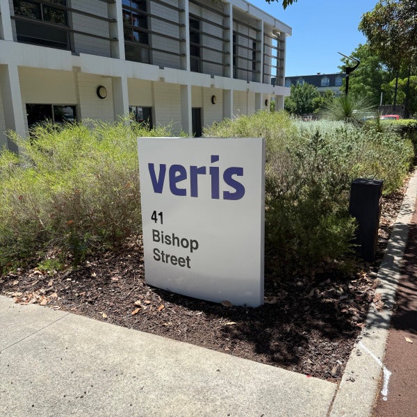
Sometimes, the smartest signage solution isn’t a full replacement — it’s a well-executed refresh. We recently worked with Veris Group to revitalise their existing pylon sign at 41 Bishop Street, giving it a clean, modern update while retaining the original structure. Over time, the original vinyl had begun to fade and no longer reflected Veris’ current brand standards. Rather than replacing the entire sign, the team opted for a re-skin, updating the vinyl to align with their refreshed brand colour — blue — and restoring the sign’s visual impact. What We Did Removed the existing, weathered vinyl Applied new high-quality vinyl in Veris’ updated brand blue Refreshed the overall appearance while retaining the existing pylon structure The result is a crisp, professional sign that feels new again — without the cost or waste of a full replacement. This project is a great example of how small upgrades can deliver big impact, extending the life of existing signage while keeping your brand looking sharp and current. If your signage is structurally sound but visually tired, a refresh may be all you need. Get in touch to find out how.
Read more
A Premium Signage Transformation for Canvas Cosmetic Clinic – North Perth

A Premium Signage Transformation for Canvas Cosmetic Clinic – North Perth

Dec 22, 2025 by Michael McHugh
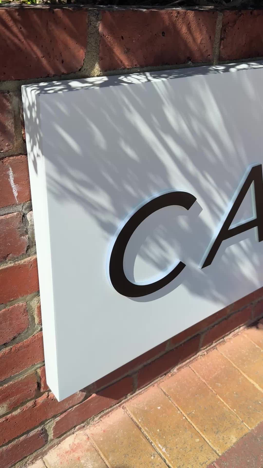
When Canvas Cosmetic Clinic prepared to open the doors to their new North Perth location, they wanted signage that felt confident, refined, and modern — while still complementing the character of the new offices. At Signarama Osborne Park, we were proud to deliver a comprehensive signage package that brings clarity, consistency, and strong brand presence from the street right through to front door. A Cohesive Brand Experience The objective was clear: create signage that guides visitors effortlessly, reinforces trust, and reflects the polished, professional nature of the Canvas brand. The result is a clean, modern signage suite that balances visibility with elegance. What We Delivered Front Retaining Wall Lightboxes We installed two ACM-faced lightboxes with push-through acrylic lettering, delivering a crisp illuminated finish that stands out day and night. These signs provide strong street presence while maintaining a sophisticated aesthetic. Car Park Signage A large ACM panel sign with black acrylic lettering clearly identifies the clinic and assists visitors as they arrive on site — practical, and on-brand. Entry Fascia Signage Above the main entry, we installed 20mm black acrylic “CANVAS.” lettering, creating a bold yet refined focal point that anchors the building frontage and elevates the overall presentation. Directional & Wayfinding Signs Several discreet but highly effective directional signs were installed throughout the site, ensuring visitors feel confident and supported from the moment they enter the property. The Result The finished signage delivers a seamless brand experience — premium, welcoming, and highly functional. Most importantly, the Canvas Cosmetic Clinic team was thrilled with the outcome, praising both the visual impact and the clarity the signage provides for their clients. If you’re planning a new location or want your signage to reflect the quality of your brand, our team would love to help.
Read more
Creating a Welcoming First Impression for Perth Child Development Centre

Creating a Welcoming First Impression for Perth Child Development Centre

Dec 19, 2025 by Michael McHugh
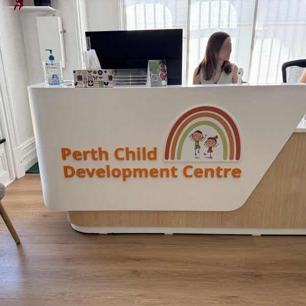
At Signarama Osborne Park, we believe signage is about more than visibility — it’s about creating confidence, comfort, and connection from the very first moment someone arrives. We were proud to partner with Perth Child Development Centre (Perth CDC) to deliver a cohesive signage package that reflects their caring, professional, and family-focused approach to developmental support. A Consistent Brand Experience — Inside and Out Perth CDC wanted signage that was clear, welcoming, and aligned with their brand values, while respecting the heritage character of their new offices in West Perth. The result is a calm, friendly visual presence that supports both wayfinding and trust. What We Delivered: External Building Plaque Installed at the main entry, this clean and understated wall sign ensures visitors can easily identify the centre while maintaining a warm, approachable aesthetic. Street-Facing Sign Positioned for strong visibility from the footpath, this fabricated steel frame with ACM panel sign clearly communicates Perth CDC’s brand, purpose, and contact details — helping families feel confident they’re in the right place before they even step inside. Internal Reception Desk Signage Inside, we installed 10mm Painted Acrylic lettering and logo to the reception desk, creating a professional yet friendly focal point. This internal signage reinforces brand consistency and immediately sets a reassuring tone for families and children. Designed with Care: Every element of this project was designed and installed with sensitivity to Perth CDC’s mission — creating an environment that feels safe, supportive, and welcoming for families seeking developmental services. We’re proud to have played a small part in helping Perth CDC present a space that reflects the incredible work they do every day. If you’re looking to refresh your signage or create a consistent brand experience across your space, our team would love to help. Signarama Osborne Park 08 9443 3663
Read more
A Strong New Look for Lovick Fabrication: 12-Vehicle Fleet Branding Completed

A Strong New Look for Lovick Fabrication: 12-Vehicle Fleet Branding Completed

Dec 12, 2025 by Michael McHugh
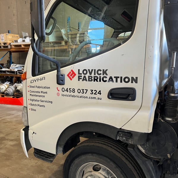
When Lovick Fabrication approached us to refresh and unify the look of their vehicle fleet, our team was ready to deliver a high-impact visual solution that showcased their brand with professionalism and consistency. We’re excited to share that the full project is now complete — 12 vehicles fully branded, including single cabs, dual cabs, and trucks. Building a Consistent, Professional Fleet Presence Lovick Fabrication specialises in steel fabrication, concrete plant maintenance, agitator servicing, batch plants, and silo work. Their teams travel across worksites daily, making their vehicles an important touchpoint for visibility and reputation. Our goal was to create a design that communicates strength, reliability, and capability — the exact qualities their clients depend on. Across all vehicle types, we ensured: Consistent logo placement for maximum visibility Clear service listings to showcase their capabilities at a glance Clean typography and layout to maintain a professional appearance Durable, high-quality materials suitable for worksite conditions Each vehicle type required a tailored approach to ensure the branding fit the available space while maintaining balance and readability. Whether it was the aluminium toolboxes on the utes or the larger doors and panels of the trucks, every graphic was measured, positioned, and applied with precision. Why Fleet Branding Matters A well-branded fleet transforms every job site and road journey into a marketing opportunity. For Lovick Fabrication, their newly refreshed vehicles now: Reinforce trust and professionalism with clients Increase brand visibility across regional and metro areas Present a unified, modern identity across all divisions Demonstrate pride in workmanship — both in their industry and ours A Project We Are Proud Of Working with Lovick Fabrication has been a pleasure, and we’re proud to support a business that values quality and strong presentation as much as we do. Their fleet now stands as a mobile extension of their brand — bold, reliable, and built to last. If your business is ready to elevate its fleet with professional signage, wraps, or rebranding, our team is here to help. Get in touch today to start your next project.
Read more
Transforming the Look of North Beach’s Newest Café – Salt & Oak

Transforming the Look of North Beach’s Newest Café – Salt & Oak

Dec 9, 2025 by Michael McHugh

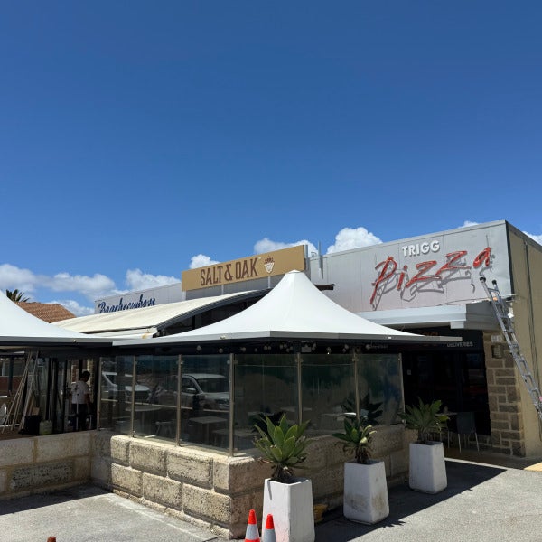
We were excited to partner with Salt & Oak, the fresh new café bringing great food and coastal charm to North Beach. Our team was engaged to enhance their street presence and help establish a strong visual identity from day one—and the results speak for themselves. A Fresh New Pylon Sign The existing roadside pylon sign needed a modern, clean update. We produced and installed a high-quality replacement digital print, designed to complement Salt & Oak’s branding while ensuring excellent visibility for passing traffic. The refreshed sign ties in seamlessly with the neighbouring businesses and gives the café instant recognition from the street. 6.5 Metre Custom Lightbox with Push-Through Acrylic Letters The hero of the project is the impressive 6.5-metre lightbox we installed across the shopfront fascia. Built for longevity and maximum visual impact, this lightbox features: Precision-cut push-through acrylic letters Even, vibrant internal illumination Durable aluminum construction designed for coastal conditions By day, the signage presents crisp, bold branding. By night, the push-through acrylic comes to life with a clean, modern glow—making Salt & Oak impossible to miss. A Thrilled Client and a Standout Result The team at Salt & Oak was thrilled with the final product, and we’re proud to have played a part in bringing their new venue to life. Thoughtfully designed signage doesn’t just look great— it drives visibility, builds brand recognition, and helps new businesses make a strong first impression. Salt & Oak is now perfectly positioned to welcome customers with a look that matches the quality of their offering.
Read more
Osborne Park

Signarama Osborne Park

1/135 Hector Street West
Osborne ParkWestern Australia6017

[email protected]. We will be closed for the Christmas break Thursday 25th Dec-11th Jan 2026.

Opening Hours:
Monday
8:00 am - 4:00 pm
Tuesday
8:00 am - 4:00 pm
Wednesday
8:00 am - 4:00 pm
Thursday
8:00 am - 4:00 pm
Friday
7:00 am - 3:00 pm

contact

Signarama Osborne Park
The more information you can provide, the faster we'll be able to assist you. For example, include the size, type of signage, quantity, and where it will be installed.

CLIENTS WE HAVE WORKED WITH:
Australia Post
Priceline
Hertz
BASF
Anytime Fitness
Rams
Youi
Ray White
Australia Post
Priceline
Hertz
BASF
Anytime Fitness
Rams
Youi
Ray White
Australia Post
Priceline
Hertz
BASF
Anytime Fitness
Rams
Youi
Ray White

Contact Us

Contact the team at Signarama Osborne Park

08 9443 3663Signarama Osborne Park
1/135 Hector Street West Osborne Park Western Australia 6017

Follow Us

Select your country:

About Signarama

With the latest technologies and a wide range of available materials, there really is no end of choice and quality in the manufacturing of Signarama Signage. Visit our corporate section to see more about:

Franchise Signarama
Own a Signarama franchise
Join our winning team and own your future with Signarama - the largest sign franchise in the industry.
Copyright Signarama. All Rights Reserved. Powered by Gorilla Dash.