

Bringing LIV EAT to Life: A Complete Signage Fit-Out in Under 4 Weeks
Sep 29, 2026 by
We're proud to share one of our biggest projects of the year: the full exterior and interior signage package for the new LIV EAT store in Leederville. From illuminated rooftop logos to more than 300 individually cut acrylic letters and a 15-metre internal feature mural, our team delivered the entire project from concept to completion in under four weeks.
LIV EAT serves bowls, burgers, burritos, coffee and smoothies, and their brand is bold, fresh and fun. Our brief was to make sure the signage carried that personality through every touchpoint, from the street to the seat.
Making an Impact from the Street
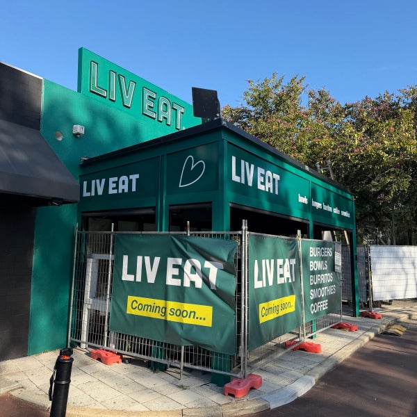
Illuminated rooftop logos. Two large LIV EAT logos now crown the top fascia, visible from every approach. Each letter was fabricated from 50mm channel letters in the brand green, with a hollow face and white flex-neon tube running through the center. By day they read as crisp, dimensional lettering; by night the neon lights up the full letterform.
ACM fascia panels. The lower front fascia at the front of the wrap around awning, features ACM panels wrapped in green vinyl, colour-matched to the building. Acrylic lettering was applied to the face, spelling out the LIV EAT name and full menu line-up: bowls, burgers, burritos, coffee and smoothies. The result is a clean, cohesive shopfront that tells passers-by exactly what's on offer.
Carrying the Brand Inside
Inside the store, we produced and installed more than 300+ individual letters, all cut from 5mm white acrylic. They feature across timber cladding, tiled planter boxes and feature walls, repeating the menu line-up in a bold, consistent style. Every letter was precisely spaced and aligned on site, which is where quality workmanship really shows.
A white flex-neon heart, taken from the LIV EAT logo, complements the white acrylic lettering and adds a warm glow to the space.
15-metre feature mural. The showpiece is a 15m vinyl wall wrap above the booth seating. The vibrant, poster-style mural brings LIV EAT's playful personality to life and gives customers a space they'll want to photograph and share.
Delivered in Under 4 Weeks
A project of this scale usually takes considerably longer. We turned it around in under four weeks by staying closely involved at every stage:
• Collaborative design. We worked hand in hand with LIV EAT's design team to fine-tune the concept and make sure every element was practical to fabricate and install.
• Precise site measures. Our team attended site several times to confirm measurements, so every panel, letter and wrap fitted perfectly first time.
• Skilled installation. Our experienced installers completed the fit-out alongside the builders, keeping the project on track for opening.
Planning a Fit-Out of Your Own?
Thank you to the LIV EAT team for trusting us with their new store. We can't wait to see customers enjoying the space.
Whether you're opening a new venue, refreshing your brand or need signage on a tight deadline, the Signarama Osborne Park team can help from concept through to installation. Get in touch today for a free consultation and quote.
Read more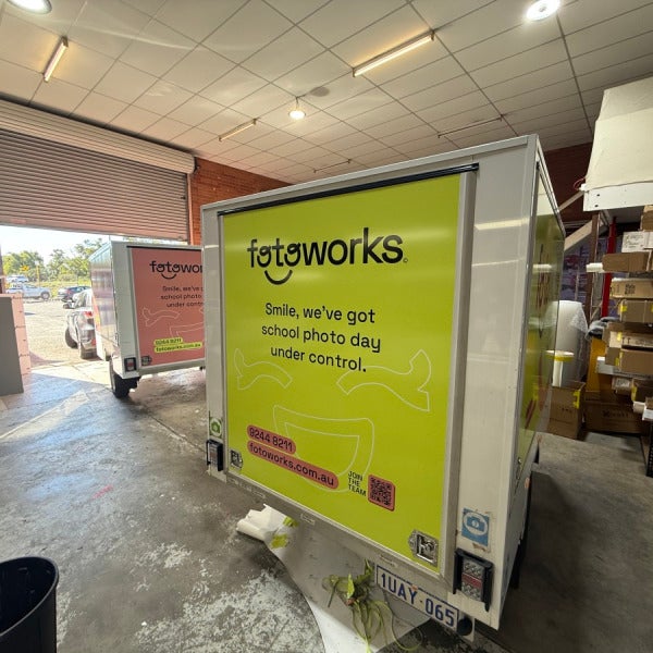
Powered by Smiles: Rebranding the Fotoworks Fleet
Sep 20, 2026 by
When Fotoworks came to us for a full fleet and shopfront rebrand, the brief was simple but ambitious: refresh over 6 vehicles, 4 trailers, and their shopfront signage with a consistent, playful new identity that would turn every job site and street corner into a piece of marketing.
The Challenge
Fotoworks captures school photo days across Perth, which means their trailers and vehicles are constantly on the move — parked outside schools, driving between jobs, and sitting in car parks in full public view. Every one of those vehicles is a moving billboard. The old branding was inconsistent across the fleet, and it was time for something that felt unmistakably "Fotoworks" wherever it showed up.
What We Delivered
Trailer wraps (x4): Each trailer received a bold new colour palette — lime green, coral pink, and sky blue — built around the Fotoworks smiley logo mark. We varied the messaging across the fleet to keep things fresh and give each trailer its own personality, including lines like:
"Smile, we've got school photo day under control."
"Fridge-worthy photography."
"Capturing keepers."
"Smiles brighter than this trailer."
"Powered by smiles."
Vehicle fleet (6+ vehicles): For the vehicle fleet including a verity of makes and models, we got a bit more playful. Rear windscreens now feature a full smiley face, cleverly using the tailgate handle and number plate as the mouth. Side panels carry the Fotoworks logo, the "Powered by smiles" tagline, and a scattering of colourful smiley icons that give each vehicle real street presence — instantly recognisable, even from a distance.
Shopfront signage: To tie it all together, we also refreshed the Fotoworks shopfront, extending the same brand language from the road to the storefront so customers get a consistent experience from first glance to final delivery.
Why Consistency Across a Fleet Matters
A single branded vehicle is a nice touch. A fully branded fleet is a marketing asset. With every trailer and vehicle carrying the same colours, tone, and smiley motif — just with enough variation to stay interesting — Fotoworks now has a fleet that's instantly identifiable across every school car park and suburb they work in. That kind of repetition builds brand recognition fast, and it's brand recognition that costs nothing extra once the signage is applied.
The Signarama Osborne Park Difference
Projects like this are exactly why we love what we do. A rebrand across 10+ assets means dozens of design variations, precise vehicle templates, and flawless installation — all while keeping the fleet on the road with minimal downtime. Every panel, decal, and shopfront piece needed to match perfectly in colour and finish, because when your brand is this visible, there's no room for inconsistency.
If your business is ready to turn your vehicles into your hardest-working marketing tool, get in touch with Signarama Osborne Park. We'll help you design and install a fleet wrap that gets noticed for all the right reasons.
Ready to give your fleet a fresh look? Contact Signarama Osborne Park today.
Read more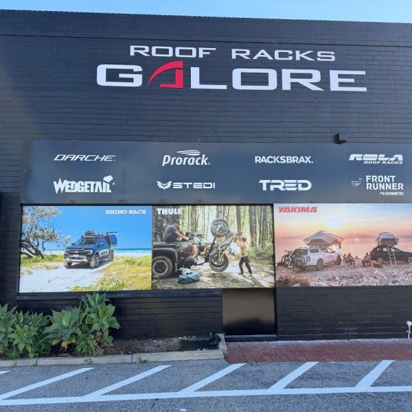
Transforming a Fascia: Roof Racks Galore, Osborne Park
Sep 13, 2026 by
When Roof Racks Galore came to us wanting a fresh look for their Osborne Park showroom, the brief was simple: turn a plain, dark fascia into a bold storefront that stops traffic and does justice to the premium brands on their shelves.
The Challenge
Roof Racks Galore stocks some of the biggest names in 4WD and touring accessories — Rhino-Rack, Thule, Yakima, Darche, Front Runner, Tracklander and more. With that many quality brands under one roof, the shopfront needed to work hard: communicate the breadth of the range at a glance, while still feeling premium rather than cluttered.
What We Delivered
We designed and installed a full suite of panel signage across the fascia, including:
A brand wall of logo panels, cleanly laid out so every supplier — from Darche and Prorack to Stedi, Tred, and Shingleback Off Road — gets clear, consistent visibility.
Large-format lifestyle imagery panels showing the products in their element: a loaded ute on the beach, a bike being unloaded in the forest, a rooftop tent set up for sunset camp. These panels do the selling before a customer even walks through the door, helping them picture their own next adventure.
Why It Works
Good signage isn't just decoration — it's part of the customer's first impression and their first interaction with the brand. By combining crisp brand panels with aspirational lifestyle photography, the new fascia gives Roof Racks Galore a shopfront that reflects the quality of the products inside, and makes the store easy to find and easy to trust from the moment customers pull into the car park.
The Signarama Osborne Park Difference
Every panel was measured, produced, and installed to a commercial finish — sharp edges, even spacing, and colours that will hold up to the Perth sun. It's this attention to detail, combined with genuine care for how the finished job represents our client's brand, that we bring to every project.
If your shopfront isn't working as hard as it should be, get in touch with the team at Signarama Osborne Park — we'd love to help you make the same kind of impression.
Read more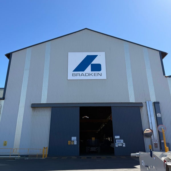
Big Signage, Bigger Impact: Delivering Large-Format Building Signage for Bradken
Sep 8, 2026 by
When Bradken — a global leader in mining and heavy industry equipment — needed to refresh the signage at their Bassendean Facility, they came to Signarama Osborne Park for a solution that could match the scale and professionalism of their brand.
The Brief
Bradken required prominent, durable building identification that could be seen from a distance across their large industrial site, along with clear directional and safety signage to guide traffic and visitors around the facility. The result needed to be built to last outdoors, easy to read at scale, and consistent with Bradken's brand guidelines.
The Solution
Working closely with the Bradken team, we designed and manufactured:
Three large-format digitally printed ACM (Aluminium Composite Material) signs, each measuring more than 6 metres, fully framed for a clean, corporate finish and long-term durability.
A series of ACM directional and operational signs, including clear reverse-parking instructions, to support safe and efficient site movement.
Every sign was digitally printed for sharp, accurate colour reproduction of the Bradken logo and brand palette, then mounted in custom frames to give a polished, professional presentation that will stand up to Perth's weather for years to come.
Delivering at Height, Safely
Given the scale of the signs and their placement high on the building facades, our installation team carried out the work using elevated work platforms, following strict safety protocols throughout. Careful planning and precise measurement ensured both large signs were installed level, secure, and perfectly positioned — a job that demands real skill when you're working with panels of this size at height.
The Result
Bradken's facility now has building signage that's impossible to miss — reinforcing their brand presence for staff, visitors, and passing traffic — along with directional signage that makes the site easier and safer to navigate.
This project is a great example of what we do best: partnering with our clients from initial design through to final installation, and delivering a result that's built to last.
Looking to make your business more visible? Whether it's large-format building signage, directional signs, or a complete site signage overhaul, the team at Signarama Osborne Park is here to help — from concept to installation. [Get in touch with us today.]
Signarama Osborne Park — Signage that means business
Read more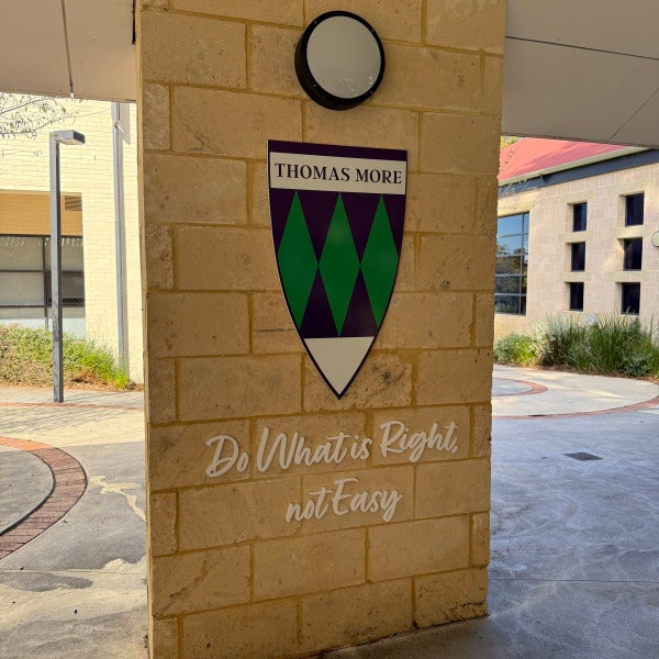
Bringing School Spirit to Life: Guild Shield Signage for Newman College
Sep 4, 2026 by
At Signarama Osborne Park, we love projects that combine craftsmanship with meaning — and our latest collaboration with Newman College is a perfect example.
Newman College asked us to design and produce a set of striking shield signs to showcase each of their guilds: Brigid, Romero, Thomas More, Camara, MacKillop, Chisolm, Marcellin, and Catherine. Each guild has its own colours, crest, and motto, and the brief was simple: create signage bold enough to be seen from across the courtyard, but refined enough to sit comfortably against the school's limestone architecture.
The Build
Every shield was crafted from 20mm PVC, digitally printed with each guild's unique crest and colour palette — from Thomas More's deep purple and green diamonds to Catherine's fiery red and green stripes. The result is vivid, durable signage built to handle Perth's outdoor conditions without fading or warping.
Beneath each shield, we mounted the guild's motto in 10mm white acrylic lettering — think "Do What is Right, Not Easy" and "One Heart, Many Hands" — giving each pillar a clean, dimensional finish that catches the light beautifully against the sandstone brick.
Why It Works
These signs do more than mark a location — they reinforce identity and pride across the school. Students walk past their guild crest every day, a small but constant reminder of the values their house stands for. That's the kind of signage we love creating: functional, durable, and genuinely meaningful to the people who see it.
Let's Talk Signage
Whether it's a school, sports club, or corporate campus, if you've got crests, mottos, or brand identities you want brought to life in three dimensions, our team at Signarama Osborne Park would love to help. Get in touch to discuss your next project.
Read more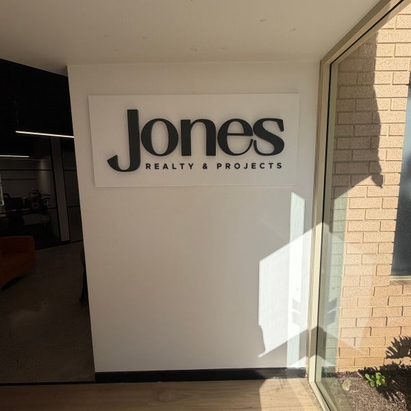
New Look, New Level: Signarama Osborne Park Delivers a Full Signage Package for Jones Realty & Projects
Aug 30, 2026 by
When Jones Realty & Projects set out to establish a brand presence that reflected their position as WA's end-to-end development partner, they turned to Signarama Osborne Park to bring their new identity to life — inside and out.
The result is a cohesive, premium signage package across the Jones office in West Leederville, covering everything from first impressions at reception through to street-level visibility.
The Scope
Illuminated Reception Sign
A back-lit 3D sign was the centerpiece of the fit-out, giving the Jones logo genuine presence as clients walk through the door. Clean, modern, and unmistakably premium — exactly the tone a leading development and projects agency needs to set.
Wall Graphics
Beyond the reception sign, we produced large-format digitally printed wall graphics carrying the Jones brand messaging and imagery through the office space, reinforcing the company's story and values in every space clients and staff move through.
Panel Wall Sign
An exterior wall-mounted digitally printed ACM panel sign was installed to promote Jones as WA's end-to-end development partner — communicating their full service offering (advisory, project marketing, and off-the-plan sales) clearly to anyone passing by.
Street Sign
A pole-mounted digitally printed ACM street sign was designed and installed to give Jones strong street-level visibility in a busy commercial precinct, ensuring the brand is seen well before someone reaches the door.
Parking Signage
Rounding out the project, dedicated parking signage was produced to support the day-to-day functionality of the site for staff and visiting clients. Made from digitally printed ACM panels and galvanised steel poles.
Why It Matters
A signage package like this does more than mark a location — it's often a client's first physical interaction with a brand. For a business like Jones Realty & Projects, where trust and professionalism are everything, every sign needed to reflect the same quality they promise their clients.
That's the kind of project we love at Signarama Osborne Park: taking a brand from concept through to a fully realised, physical presence — done right, the first time.
Read more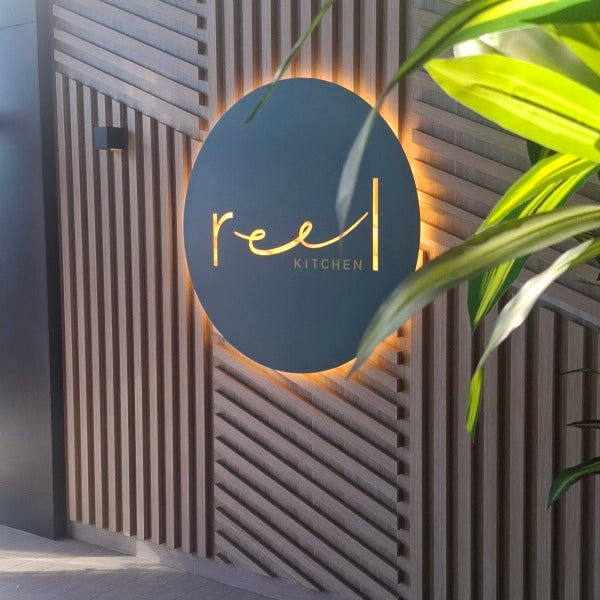
A Grand Entrance for Reel Kitchen at DoubleTree by Hilton
Aug 25, 2026 by
When DoubleTree by Hilton, Perth Waterfront set out to launch Reel Kitchen, their new signature restaurant, they wanted an entry that would set the tone before a single guest sat down to eat. Signarama Osborne Park was proud to partner with the Hilton team to bring that vision to life.
The Brief
Reel Kitchen needed signage that matched the sophistication of its interior design — warm timber, contemporary lines, and a menu built around fresh, coastal flavours. The entry statement had to feel premium, be visible from the foyer approach, and work seamlessly with the architectural timber slat feature wall already in place.
What We Delivered
A backlit stainless steel stencil cut disc 1200mm in diameter. At the heart of the entry sits a large-format oval disc, custom painted in a deep green and precision stencil-cut in stainless steel to reveal the Reel Kitchen script logo. Halo and cut-through LED lighting gives the sign a warm, golden glow that lifts the timber paneling around it and draws the eye straight to the entrance — day or night.
An upgraded outdoor lightbox face. The exterior blade sign, mounted along the Barrick Street Jetty walkway, received a full face upgrade — crisp, evenly lit, and legible from a distance, helping Reel Kitchen stand out among the precinct's dining and hospitality offering.
We also installed new directional signage. To complete the experience, we produced updated wayfinding signage, ensuring guests move confidently from the street, through the foyer, and into the restaurant itself.
Why It Matters
Good signage does more than display a name — it's the first handshake between a brand and its guest. For a restaurant of Reel Kitchen's calibre, the entry needed to promise quality before the first course even arrives. That's the standard we hold ourselves to on every project, whether it's a single entry sign or a full precinct signage package.
If you're planning a fit-out, refresh, or new venue launch and want signage that does your brand justice, Signarama Osborne Park would love to help you make the same kind of first impression.
Read more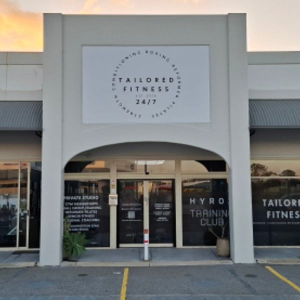
From Concept to Completion: Bringing Tailored Fitness's New Brand to Life
Aug 21, 2026 by
When Tailored Fitness in Osborne Park decided it was time for a re-brand, they needed a signage partner who could manage the entire journey — not just supply and install, but help shape the look and feel of the new identity from the ground up. That's exactly the brief Signarama Osborne Park was proud to deliver on.
The Brief
Tailored Fitness operates a busy 24/7 gym facility, offering everything from strength and conditioning to reformer Pilates, boxing and small group training. As their brand evolved, so too did the need for signage that reflected their new positioning — clean, modern and unmistakably "Tailored Fitness" from every angle of the building.
Our Scope of Works
Our team managed the project end to end, including:
Design development – working closely with Tailored Fitness to translate their new brand guidelines into signage that would work across multiple formats and viewing distances
Fascia signage replacement – removing the existing signage and installing new digitally printed panels across the building's fascia
Side wall lightbox update – refreshing the illuminated signage to align with the new brand look, ensuring visibility day and night
Window graphics – designing and installing new window graphics throughout the storefront, reinforcing the brand and communicating key services to passers-by
Why Full-Service Matters
Projects like this highlight the value of working with a signage partner who can handle every stage in-house. Rather than coordinating between separate designers, printers and installers, Tailored Fitness had a single point of contact throughout — from the first design concept through to the final panel being installed on site.
This approach reduces friction, keeps timelines tight, and ensures the finished product matches the original vision, because the same team that designed it is the team that installed it.
The Result
The finished signage package gives Tailored Fitness a strong, cohesive presence across their entire facility — fascia, lightbox and windows all working together to reflect their new brand identity and stand out within the busy Hepburn Heights Plaza precinct.
It's this kind of project — multiple elements, and delivered with genuine care at every step — that we love taking on.
Looking to re-brand or refresh your business signage? Get in touch with Signarama Osborne Park to talk through your project, from concept to installation.
Read more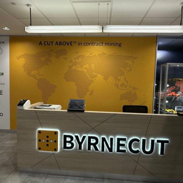
A Cut Above: Bringing Byrnecut's Reception to Life
Aug 17, 2026 by
This week the Signarama Osborne Park team completed a standout project for Byrnecut, a global leader in underground contract mining. When a business built on precision, safety and performance briefs you on their new training office reception, the signage has to match that standard. Here's a look at what we delivered.
The Brief
Byrnecut wanted a training reception space that reflected their global footprint, their "A Cut Above in contract mining" brand promise, and the career pathway they offer their people — all while giving visitors an immediate, professional first impression. The project came together in three parts.
1. Backlit Illuminated Reception Sign
At the heart of the reception desk sits a BYRNECUT 3D logo backlit sign. The halo-lit effect gives the sign real presence without overpowering the space. Illuminated signage like this is one of the highest-impact ways to make a reception area feel premium — it's the first thing a visitor's eye is drawn to.
2. Wall Graphics
Behind the reception desk, we produced a full feature wall in Byrnecut's mustard-gold brand colour, featuring a dotted world map to reflect their international operations and the tagline "A Cut Above in contract mining" in clean, bold type. Alongside it, a supporting wall carries the logos of Byrnecut's partner brands and subsidiaries, neatly aligned for a polished, corporate finish. Together, these graphics turn a plain wall into a genuine brand statement.
3. Digitally Printed Pillar Wrap
The standout creative piece was a full pillar wrap, digitally printed and wrapped seamlessly around a structural column in the reception area. The design tells the story of a Byrnecut career pathway — from Truck Driver through to Project Manager — using a flowing arrow graphic under the heading "Your Pathway Starts Here." Wrapping graphics cleanly around a curved column takes careful print preparation and precise installation to avoid any visible seams or distortion, and it's exactly the kind of detail we take pride in getting right.
The Result
A cohesive, branded reception that tells Byrnecut's story before a single word is spoken — global reach, strong partnerships, and genuine career opportunity, all delivered through considered design, quality print, and expert installation.
Looking to make the same kind of first impression for your business? Get in touch with Signarama Osborne Park to talk through illuminated signage, feature walls, or custom pillar and column wraps for your office or reception.
Read more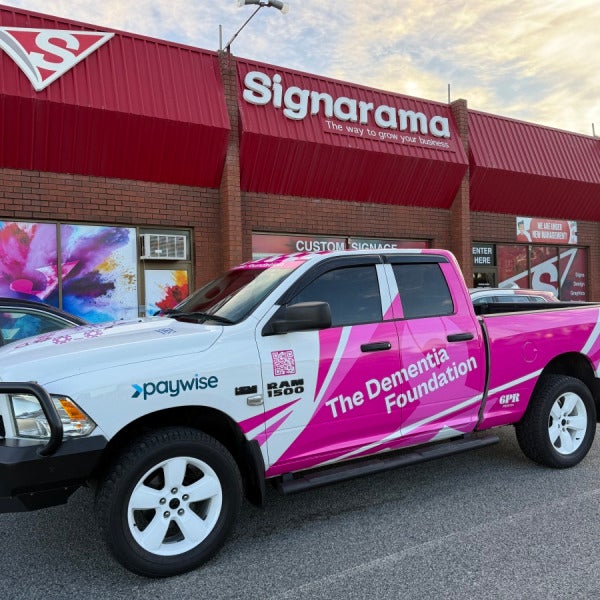
Back on the Road: Signarama Osborne Park Wraps Another Vehicle for The Dementia Foundation
Aug 10, 2026 by
We were proud to welcome The Dementia Foundation back to our workshop recently, this time to wrap a new RAM 1500 ahead of their next big fundraising adventure.
This isn't our first project with The Dementia Foundation, and every time they roll through our doors, it's a reminder of why we do what we do. Custom vehicle wraps aren't just about making a truck look sharp (although this one certainly does) — they're about turning a vehicle into a moving billboard for a cause that matters.
## The Brief
The Dementia Foundation needed a wrap that would work as hard as their team does. The result is a bold pink and white design featuring:
- Full colour wrap with The Dementia Foundation branding across the doors, bonnet and tailgate
- A striking pink and white checkerboard roof
- QR codes linking directly to tdfwa.org.au and drive4dementia.com.au for easy donations and information on the go
- Sponsor and partner logos, including Paywise, Car Vault 365, GR8 Disability Housing and 2Flourish
- Branding for "The Big Lap 2026" — the Foundation's next major fundraising drive around WA
Every element was designed to be eye-catching from a distance and functional up close, so wherever this truck travels, it starts a conversation about dementia awareness and support.
## Why It Matters
The Dementia Foundation does incredible work supporting individuals and families affected by dementia across Western Australia. Their fundraising drives, like The Big Lap, cover serious distance — which means this wrap needs to hold up to sun, dust and thousands of kilometers on the road, without losing its impact.
That's where quality matters. A vehicle wrap is only as good as the material and the install behind it. We use premium wrap vinyl and an experienced installation team to make sure the finish is seamless, durable, and looks just as sharp on the last day of the trip as it did on day one.
## A Partnership We're Proud Of
Seeing The Dementia Foundation return to us for another vehicle says a lot. It tells us they trust the quality of our work and the level of service we provide — and that's exactly the reputation we've set out to build here at Signarama Osborne Park.
We wish the team all the best as they hit the road again for The Big Lap 2026. Keep an eye out for this bright pink RAM 1500 as it makes its way around the state — and if you see it, scan the QR code and show your support.
**Need a vehicle wrap that turns heads and gets results?** Whether it's a single ute or a full fleet, the team at Signarama Osborne Park can help you design and install a wrap that represents your brand — or your cause — on the road. Get in touch with us today.
Read more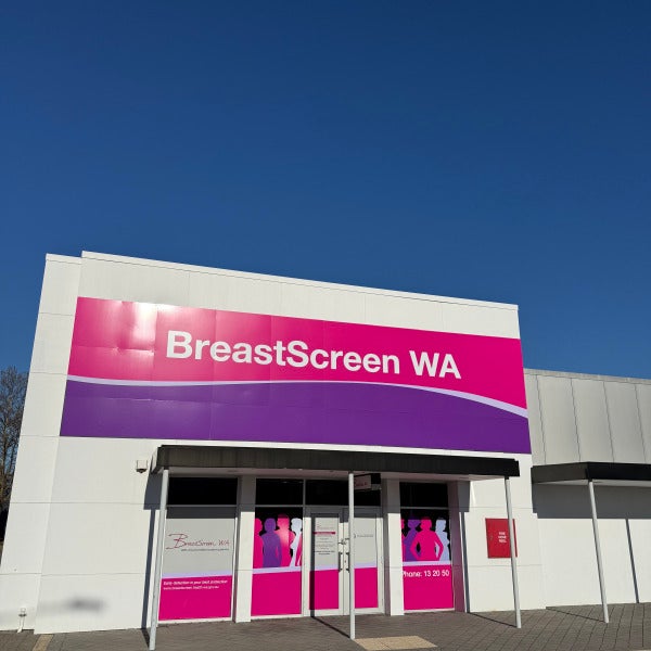
Signage Refresh for BreastScreen WA
Aug 4, 2026 by
At Signarama Osborne Park, we're proud to have partnered with BreastScreen WA to refresh their window signage across multiple sites throughout Western Australia, along with a fascia upgrade at their Cannington clinic.
The Project
BreastScreen WA is the state's only accredited breast screening service, and their clinics are trusted, welcoming spaces for thousands of West Australian women every year. When it came time to update their look, they needed a partner who could deliver consistent, professional branding across a wide network of sites — without disrupting day-to-day clinic operations.
Our scope of work included:
Window graphics at multiple BreastScreen WA locations across WA, featuring their updated pink and purple brand palette, clinic opening hours, entry signage, and clear contact information
Full fascia signage at the Cannington site, giving the building a bold, unmistakable street presence
Consistent brand application across entry doors, glazing, and building frontage, so every client walks into a space that looks and feels like BreastScreen WA, no matter which suburb they're in
Why It Mattered
For a health service, signage isn't just decoration — it's wayfinding, reassurance, and trust. Clear, consistent branding helps clients feel confident they're in the right place, reinforces the professionalism of the service, and supports BreastScreen WA's mission of encouraging early detection across the state.
Rolling out a cohesive brand across many sites also comes with real logistical challenges: different building facades, varying window configurations, and the need to keep clinics operational throughout installation. Our team managed the full process end-to-end, from measure and design through to installation, ensuring every site met the same high standard.
The Result
A refreshed, unified presence for BreastScreen WA across Western Australia — clean window graphics, clear signage, and a striking new fascia at Cannington that stands out on the street while staying true to the brand.
This project reflects exactly the kind of work we love doing at Signarama Osborne Park: multi-site rollouts that demand precision, consistency, and genuine care for the client's brand and their customers' experience.
**Looking to refresh your signage across one site or fifty?** Get in touch with the Signarama Osborne Park team — we'd love to help.
Read more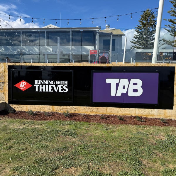
Pouring on the Brand: Signage for Running with Thieves Brewery, Henderson
Jul 31, 2026 by
When Running with Thieves brewery in Henderson needed signage that matched the energy of their brand, they turned to the team at Signarama Osborne Park. The result is a complete signage package that carries the brand from the street right through to the taps.
The Brief
Running with Thieves needed their branding to work across multiple environments — bold enough to be seen from the road, sharp enough to hold up on a busy shared entrance sign, and refined enough to sit behind the bar as part of the customer experience. Consistency was key: every touchpoint needed to look and feel like the same brand.
What We Delivered
Exterior building signage a large-format ACM sign was installed on both ends of the building, ensuring the Running with Thieves name is visible from multiple approaches. Clean white lettering on a black background against the building's coastal-style cladding gives it a striking, high-contrast presence.
We also produced a large ACM panel sign in a robust slider frame on the front verge wall, this sign enables the team to interchange the panels when required with specials and other important information.
Internal beer tap signage was also installed, reinforcing the brand at the exact moment customers are ordering. It's a small detail, but it's the kind of finishing touch that makes a venue feel fully considered and professional. Finally we upgraded the existing lightbox pylon with brand new faces.
Why It Matters
Good signage does more than display a name — it builds trust, reinforces brand recognition, and creates consistency across every customer touchpoint, from the car park to the bar. For Running with Thieves, that meant a cohesive identity from the moment customers arrive to the moment their pint is poured.
The Signarama Difference
Projects like this are exactly why we do what we do. From concept through to installation, our focus is on getting every detail right — because for a growing brand, every sign is a chance to make an impression.
Looking to elevate your venue or business with signage that works as hard as you do? Get in touch with Signarama Osborne Park to discuss your next project.
Read more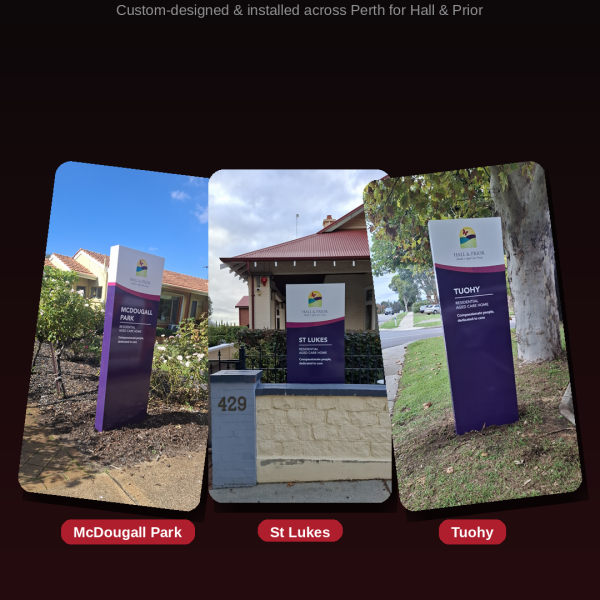
From Design to Install: Totem Pylon Signage for Hall & Prior
Jul 24, 2026 by
When Hall & Prior needed consistent, high-quality entry signage across several of their residential aged care homes in Perth, they came to Signarama Osborne Park for a complete design-to-install solution.
The result: a series of totem pylons installed at Hall & Prior sites including McDougall Park, St Lukes, and Tuohy — each one built to the same brand standard, and each one made to last.
What Is a Totem Pylon?
A totem pylon is a freestanding, vertical sign structure — the kind you'll see marking the entrance to an aged care home, medical centre, school, or corporate site. Done well, it's the first physical impression a visitor has of a business. That's exactly why we treat every totem pylon as a precision build, not just a sign.
Each of the Hall & Prior totems was constructed with:
Aluminium frame — a fully welded aluminium substructure for long-term structural integrity and weather resistance, engineered to stand up to Perth's sun and coastal conditions.
ACM v-groove panels — Aluminium Composite Material panels precision v-grooved for crisp, seamless corners and a premium, monolithic finish, rather than visible fixings or butted edges.
Digitally printed face — full-colour, high-resolution digital print applied directly to the face panel, reproducing the Hall & Prior brand identity, colours, and messaging with sharp detail that holds up outdoors.
Our Process: Design to Install
This project reflects the same process we bring to every job, regardless of scale:
Design & brand alignment — working from Hall & Prior's brand guidelines to ensure every totem is consistent across sites.
Engineering & fabrication — building the aluminium frame and ACM panels in-house, to spec, for a durable finished product.
Digital printing — producing the face graphics with commercial-grade printing for colour accuracy and UV durability.
Site installation — professional installation at each location, finished to a standard that reflects on both Hall & Prior and Signarama.
Why It Matters
For an aged care provider like Hall & Prior, consistent, professional signage across multiple sites builds trust before a visitor even walks through the door. For us, it's an example of the standard we hold ourselves to on every project — from a single shopfront sign to a multi-site rollout.
If your business needs signage that's consistent, durable, and installed properly the first time, get in touch with Signarama Osborne Park.
Read more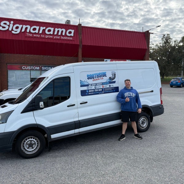
How Vehicle Magnets Helped Southside Drain Co Hit the Road in Style
Jul 20, 2026 by
When Lachlan Cook launched Southside Drain Co, a new blocked drains and CCTV inspection business servicing Bull Creek, Perth and the Southern Suburbs, he needed his van looking professional from day one — without a big upfront spend.
That's where we came in.
The Brief
Lachlan wanted something simple but effective: branding that would make his Ford Transit instantly recognisable on the road and in customers' driveways, while he focused his budget on getting the business established.
Our Recommendation: Tailor-Cut Vehicle Magnets
Based on Lachlan's needs we recommended custom-cut magnetic signage — panels precisely shaped to fit the van's rear doors and side panel. It's one of the most affordable ways for a new or growing business to look fully branded and professional, with a few added advantages:
Cost-effective — a fraction of the price of a full wrap or decals
Professional finish — clean, tailored fit rather than a generic rectangle stuck on the door
Flexible — magnets can be repositioned, removed, or updated as the business grows or the fleet changes
Fast turnaround — perfect for businesses that need to get moving quickly
The result: a van that clearly displays the Southside Drain Co branding, contact number and services offered — turning every job site and every trip through the suburbs as a marketing opportunity.
The Outcome
Southside Drain Co now hits the road with a clean, professional look that builds instant trust with customers — exactly what a new business needs while it builds its reputation.
Thinking about how to get your business noticed on the road? Vehicle magnets are a great low-cost starting point, and we can help you scale up to decals or a full wrap as your business grows. Get in touch with the team at Signarama Osborne Park to talk through the right option for you.
Read more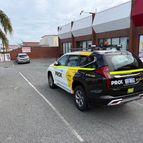
Mine-Spec Compliance Meets Brand Identity: Our PROK Fleet Wrap
Jul 17, 2026 by
When PROK came to us needing a key vehicles wrapped, the brief was clear: the vehicle had to stand out as PROK on the road, but they also needed to meet mine-site safety standards for any team members visiting site. That meant balancing brand presence with mandatory high-visibility compliance — and getting both right.
The Brief
A half wrap that puts the PROK brand front and centre
Mine-spec high-visibility reflective tape, positioned correctly for site compliance
Clear asset numbering (PROK01) for fleet identification and tracking
A finish durable enough for the demands of regular site and road use
Working Through the Design
We sat down with the PROK team early and worked through the design collaboratively from the first concept right through to final install. That close collaboration mattered — mine-spec high-vis requirements aren't just a sticker placed wherever it fits. The reflective tape has to sit at the correct height and coverage around the vehicle to meet site access requirements, while still working with the wrap's black, white, and yellow colour blocking so the end result looks deliberate.
The final design carries:
A bold black and white split wrap with the PROK logo prominent on both sides and the rear
A continuous yellow reflective high-vis band running the length of the vehicle, meeting mine-spec visibility standards
The PROK01 asset number clearly displayed on the rear bumper for easy fleet identification
prok.com displayed across the rear and sides for brand visibility on the road
Why It Matters
For a business like PROK, fleet vehicles are a daily, moving advertisement — but for vehicles that need site access, compliance isn't optional. Getting the high-vis placement wrong can mean a vehicle gets turned away at the gate. Getting the design right means PROK's vehicles look sharp, stay compliant, and are instantly identifiable as company assets whether they're parked at the depot or on site.
This is the kind of job we enjoy most: working closely with a client through every stage of the design, getting the technical requirements exactly right, and installing a wrap that's built to last.
Looking to Wrap Your Fleet?
If your business needs fleet signage that combines strong branding with compliance requirements — mine-spec, transport, or otherwise — we'd love to help. Get in touch with the team at Signarama Osborne Park to talk through your fleet's needs from design to install.
Read more

Signarama Osborne Park
1/135 Hector Street West
Osborne ParkWestern Australia6017
[email protected]. We will be closed for the Christmas break Thursday 25th Dec-11th Jan 2026.
Opening Hours:
Monday
8:00 am - 4:00 pm
Tuesday
8:00 am - 4:00 pm
Wednesday
8:00 am - 4:00 pm
Thursday
8:00 am - 4:00 pm
Friday
7:00 am - 3:00 pm
contact
Signarama Osborne Park
CLIENTS WE HAVE WORKED WITH: